
Context
Completed
Freelance
Construction Industry
Website
Blog
Institutional
Multiple pages
Wireframes
UI Design
Style guide
Prototype
Deliverables
UI Design
Prototyping
Style guide
Project
Institutional Website
Construction industry
4 pages
Timeline
May - June 2024
Rio Grande do Sul
Brazil
Tools

Figma

Google Drive

Google Meet
Google Forms
Framer
The proposal
I was approached by the company with the goal of creating an institutional website that would strengthen the brand’s online presence and attract new clients. The client wanted to innovate in the construction sector by offering more accessible and effective project analysis, organization, and planning services, through a remote execution model – something that is not yet widely used in the industry.
The project should follow a clean and modern aesthetic, featuring 3 page categories: home, benefits for each client segment (Construction Companies, Architects, and Businesses), and a blog page.
Wireframes
With the proposal defined and the objectives aligned, I created 3 variations of wireframes for the homepage, responsible for capturing the client’s attention and concisely presenting the company’s proposal and available services.
A navegação escolhida foi a tradicional no topo da página com links e submenus que levariam às diferentes categorias de páginas e futuros artigos do blog.
At this initial stage, the client opted not to create a dedicated blog page, reserving calls to action and article galleries to appear on both the homepage and pages directed to each customer segment. In this case, an article related to the sector is featured.
For the article page, a simple structure that allowed great flexibility in arranging content while respecting CMS platform constraints, showcasing different sizes and styles available through the markdown (MD) language.
Visual Design
With the overall content layout defined by the wireframes, I began exploring styles and color palettes. The first proposal focused on bringing the digital world to the predominantly physical and in-person realm of construction.
The design featured many lines and right angles in a monochromatic palette, with the help of external graphics in thin lines that complemented the aesthetic.

The second proposal was a traditional landing page design, featuring clearly defined sections and a strong focus on service descriptions in dedicated areas. The other pages adhered to this style and aesthetics, offering high modularity for easy adaptation to changes and growth in the future.
Proposed design
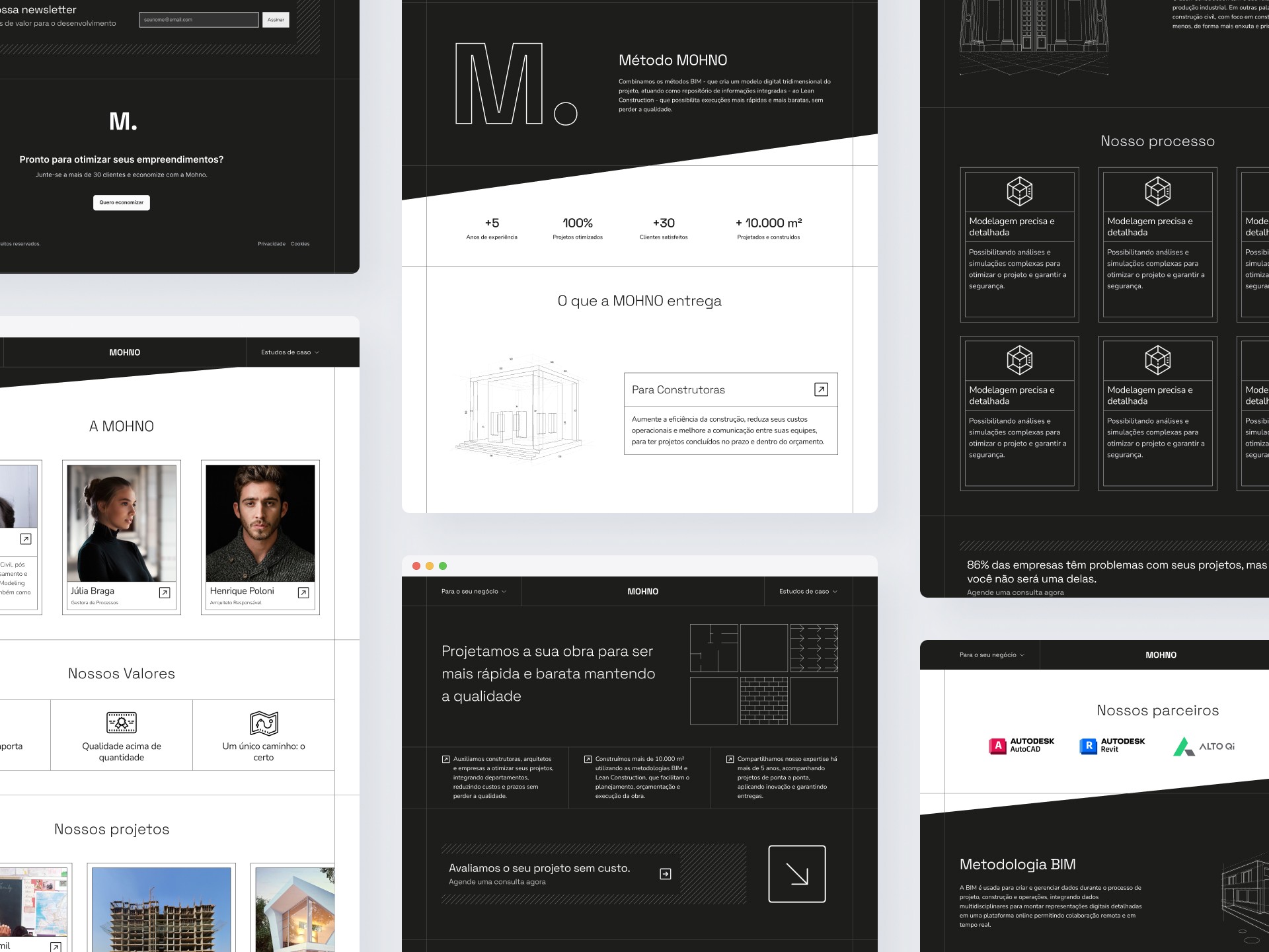
The proposed design was highly characterized and guided by the client’s desire to bring the digital world into the realm of construction. In this vein, I drew inspiration from architectural floor plans, sketches, and other documentation used by architects and engineers, two of the company’s primary clients.
The images used in this proposal were created and belong to Freepik and can be accessed here.
The design featured thin lines and predominantly right angles, with only a few slightly rounded corners to convey a sense of accessibility, something not too raw, more modern.
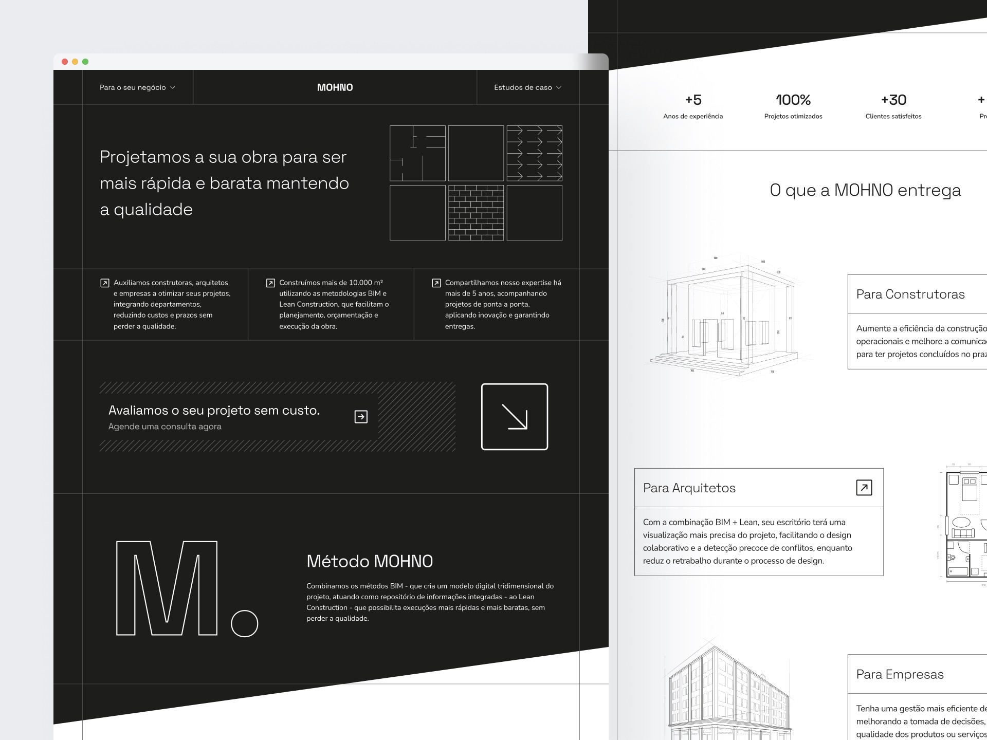
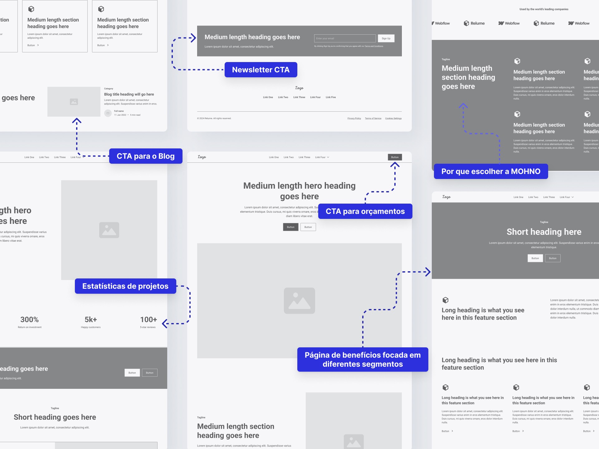
The homepage featured some statistics on completed projects, along with brief descriptions that directly conveyed the company’s proposition. Below, a CTA for a free assessment.
Each client segment had a dedicated call-to-action with specific descriptions tailored to their use cases, accompanied by thin architectural graphics that complemented the established aesthetic and broke up the text heavy content.
BIM and Lean methodologies—computerized analysis processes often unfamiliar to professionals in the field—were explored in depth alongside an invitation to partner with our software systems.
Further down, the combined method’s stages and workflows were detailed, showcasing the company’s optimized approach. Followed by another clear call-to-action for a free evaluation.

Photos and real names of the partners have been changed to preserve their privacy.
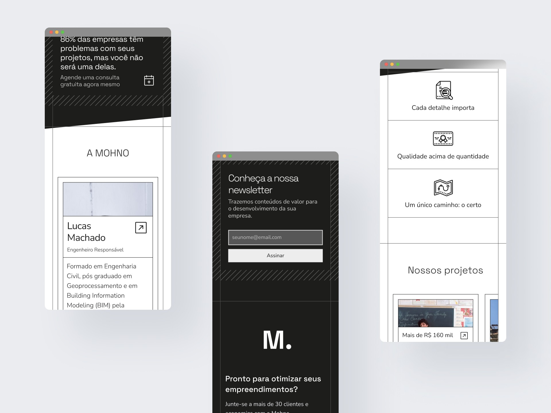
Initially, the scope didn't include a dedicated page for the MOHNO team. To address this, I added a section highlighting the co-founders and their shared values—strengthening trust in the brand’s leadership.
Below, a curated gallery of blog articles showcases real-world projects, case studies that prove the company’s competence and method efficacy. A client logo strip reinforces social proof.
Finally, but just as important, a low-pressure newsletter CTA, inviting visitors to sign up. The newsletter delivers practical insights, in-depth project breakdowns and real world case studies.
Mobile

Despite the extensive array of design elements across multiple breakpoints, the transition to smaller layouts remains seamless. The bevelled background remains the most significant constraint—but is not impossible.
Chosen design
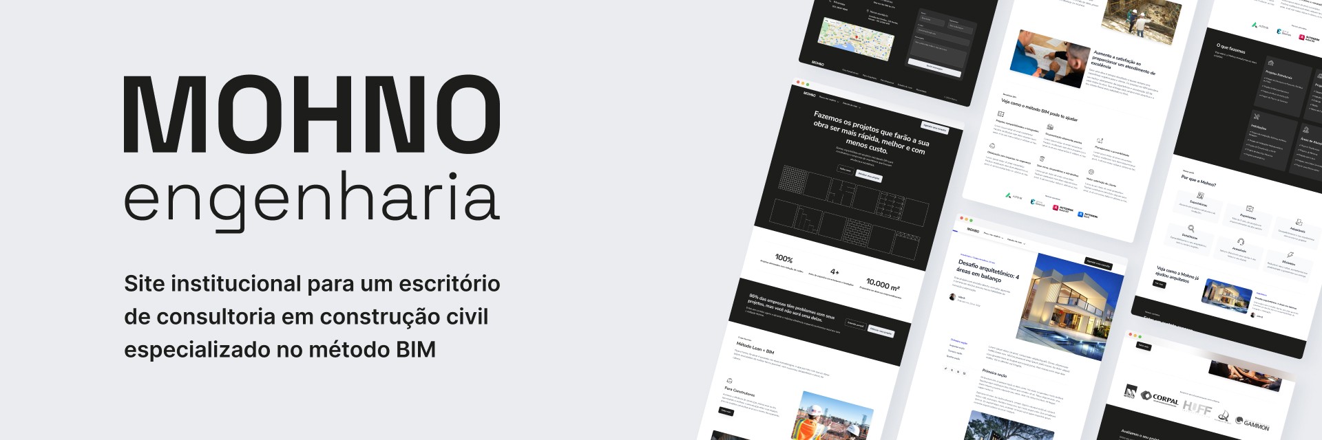
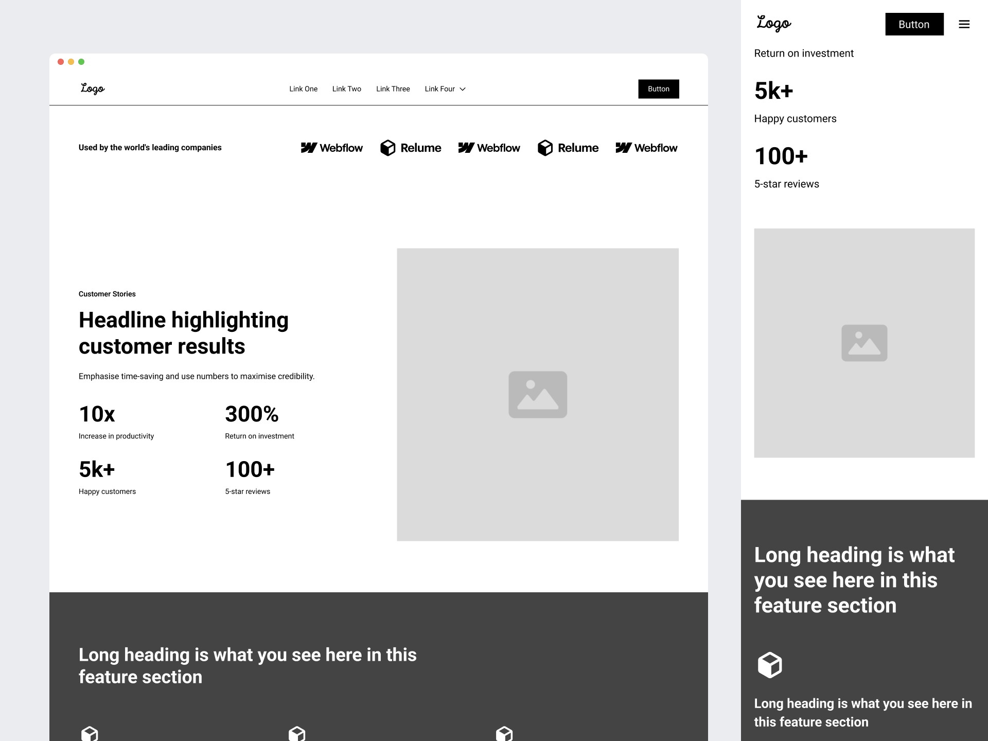
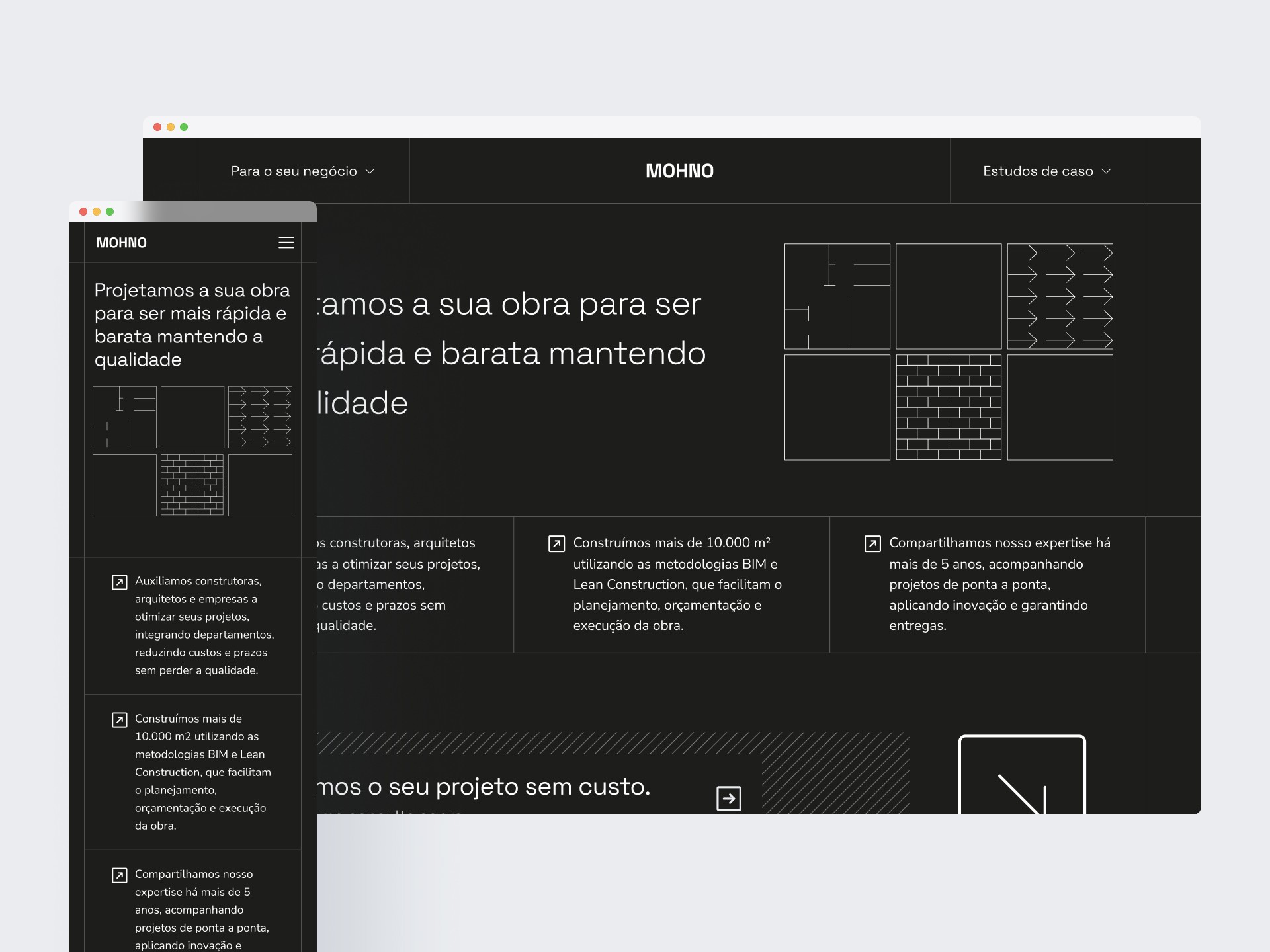
Despite the proposed design direction, the client chose a more traditional aesthetic for the site—featuring clearly defined sections, extensive textual content, and fewer visual graphics.
Home page
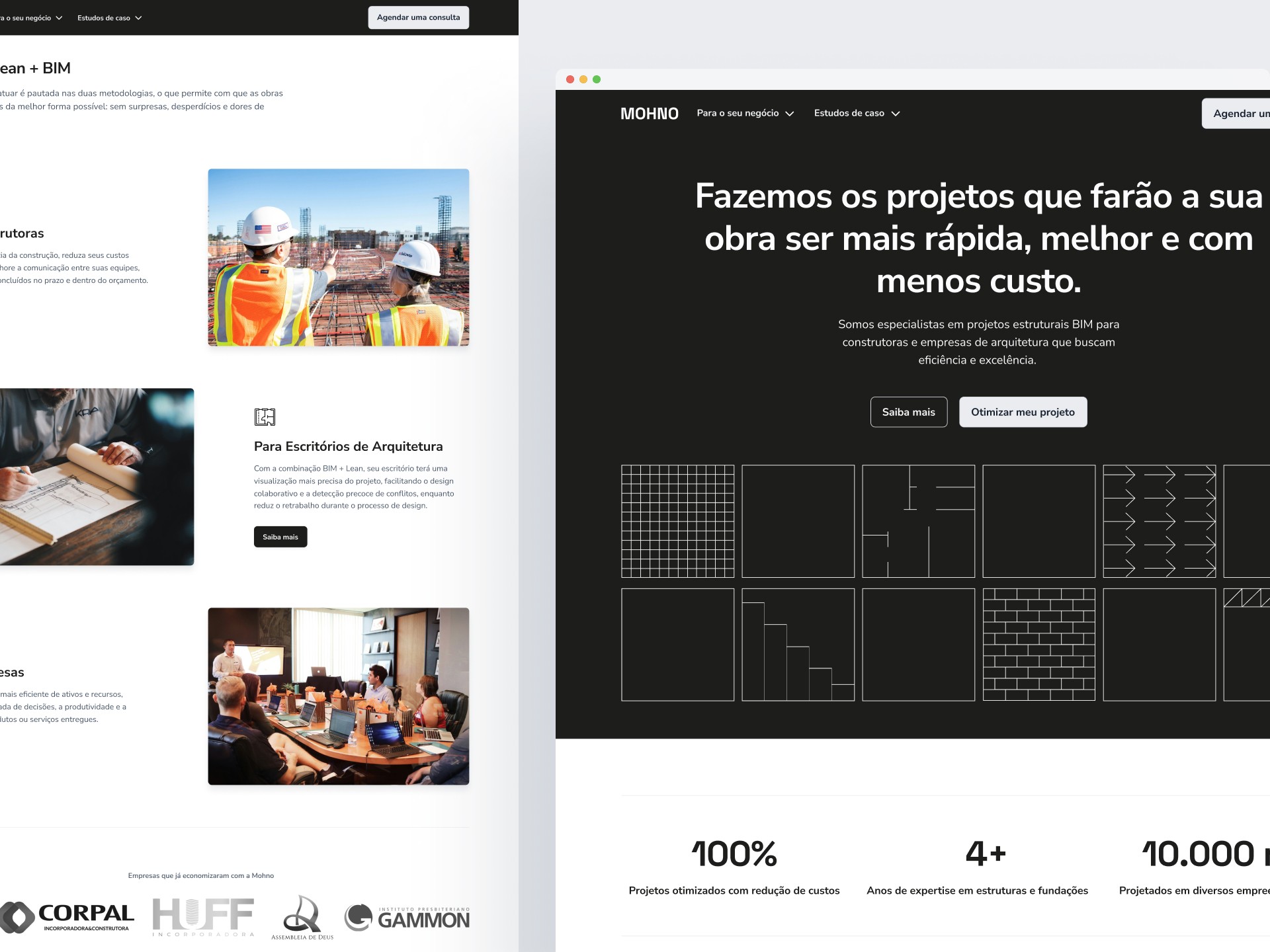
The hero section of the homepage clearly outlines the company’s proposition, supported by a cohesive set of graphic elements borrowed from the brand’s social media feed.
Below the fold, targeted calls-to-action introduce each client segment, accompanied by a concise breakdown of the methodology applied to their use cases.
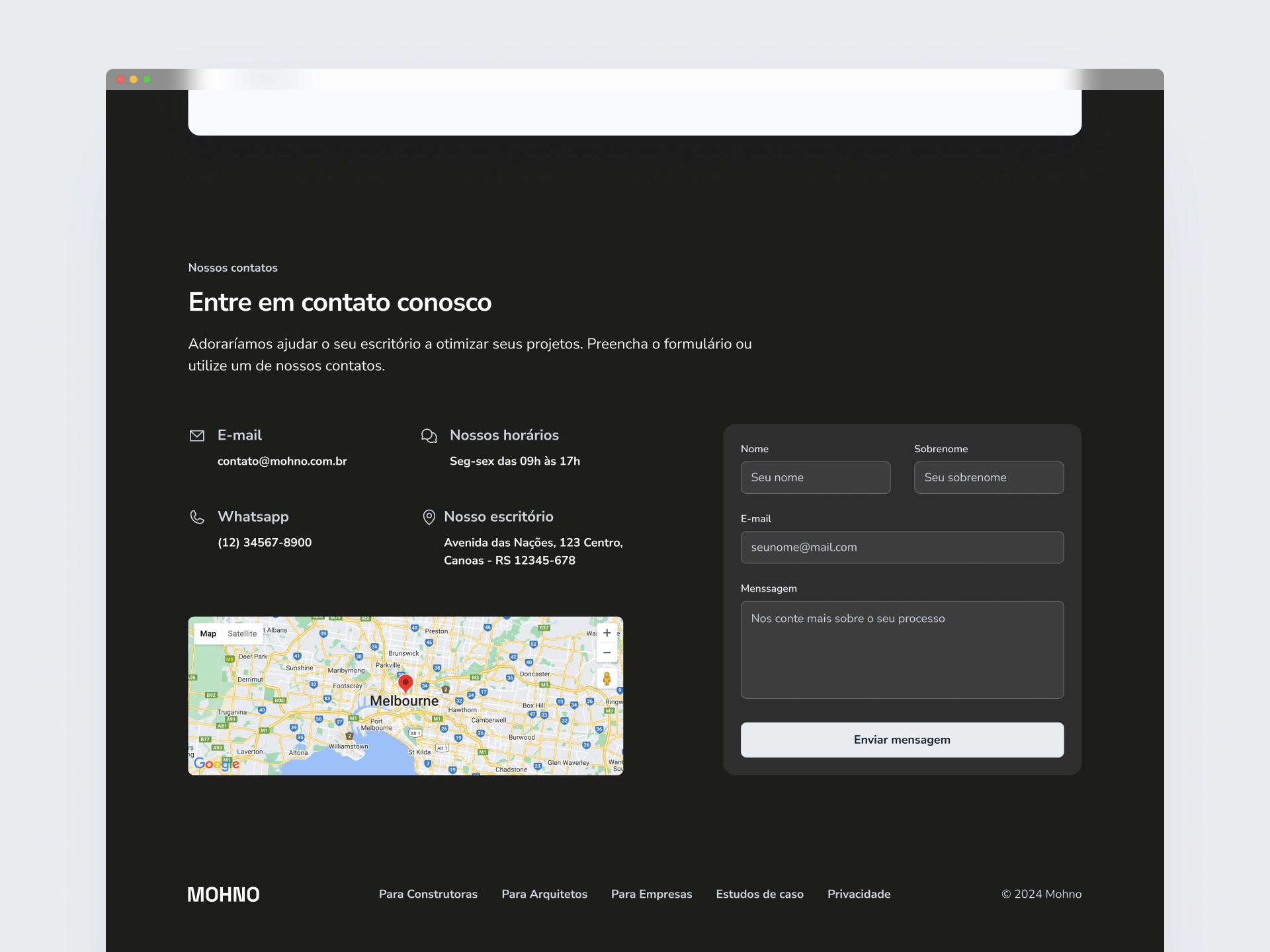
This footer streamlines communication: access to contact info and location mapping (via embedded map). Meanwhile, the inquiry form converts interest into data—helping teams request custom estimates proactively.
Benefits by client segment
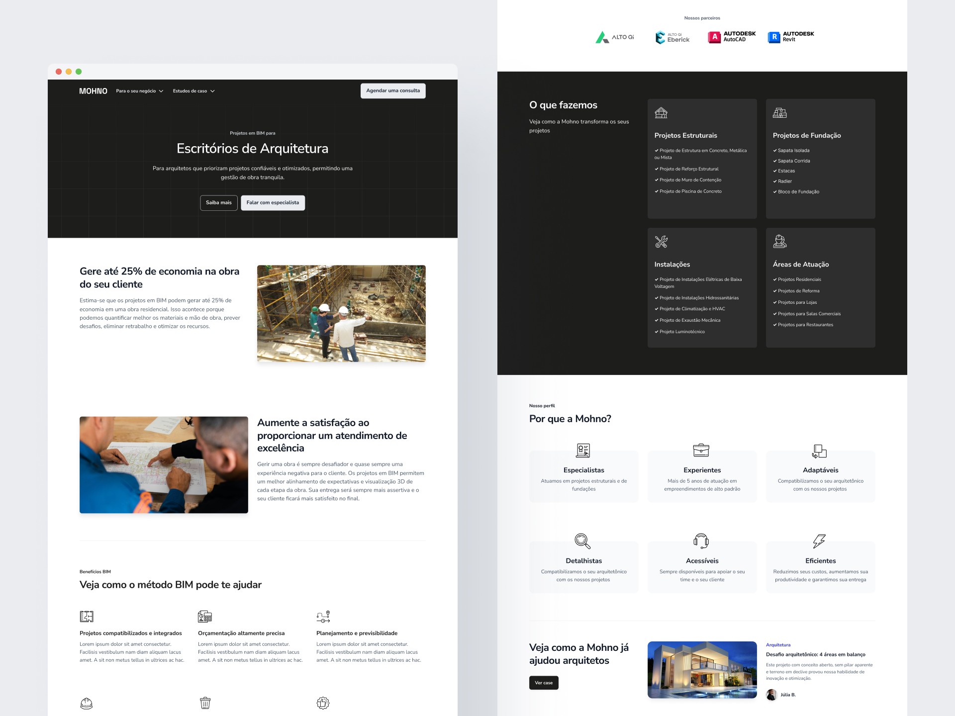
This page breaks down MOHNO’s process model, pairing value propositions with project-specific applications. A visually striking section highlights specialized services—each paired with practical case studies—organized by sector. Ideal for teams evaluating how this method aligns with their operational goals.
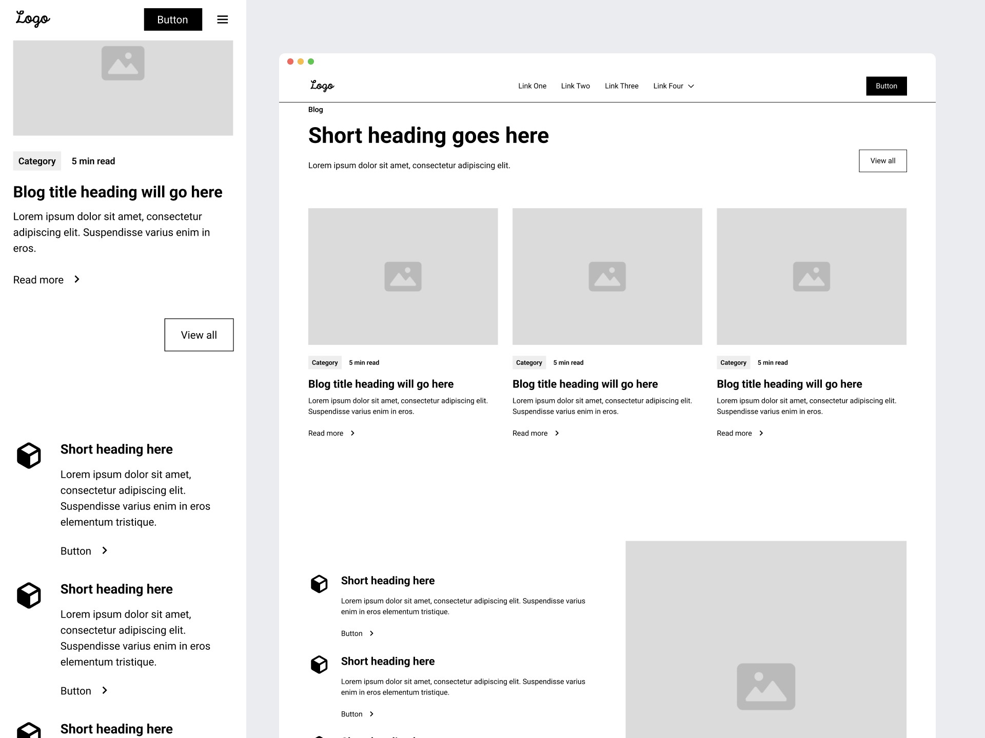
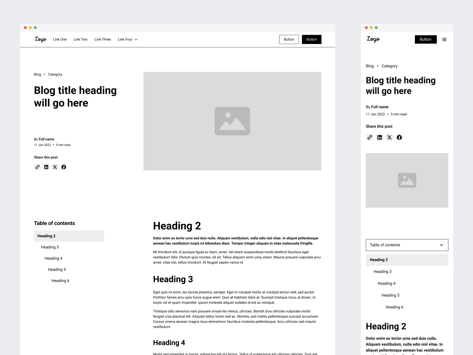
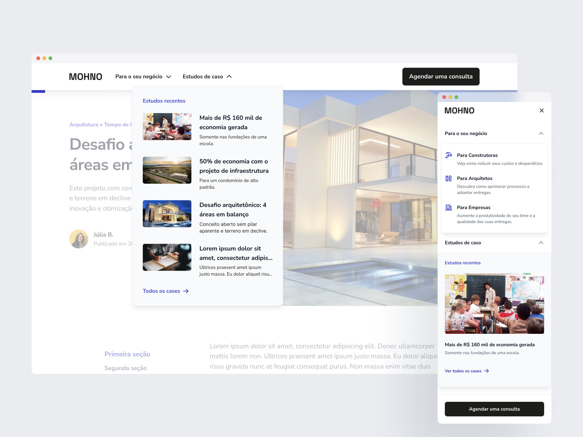
Blog
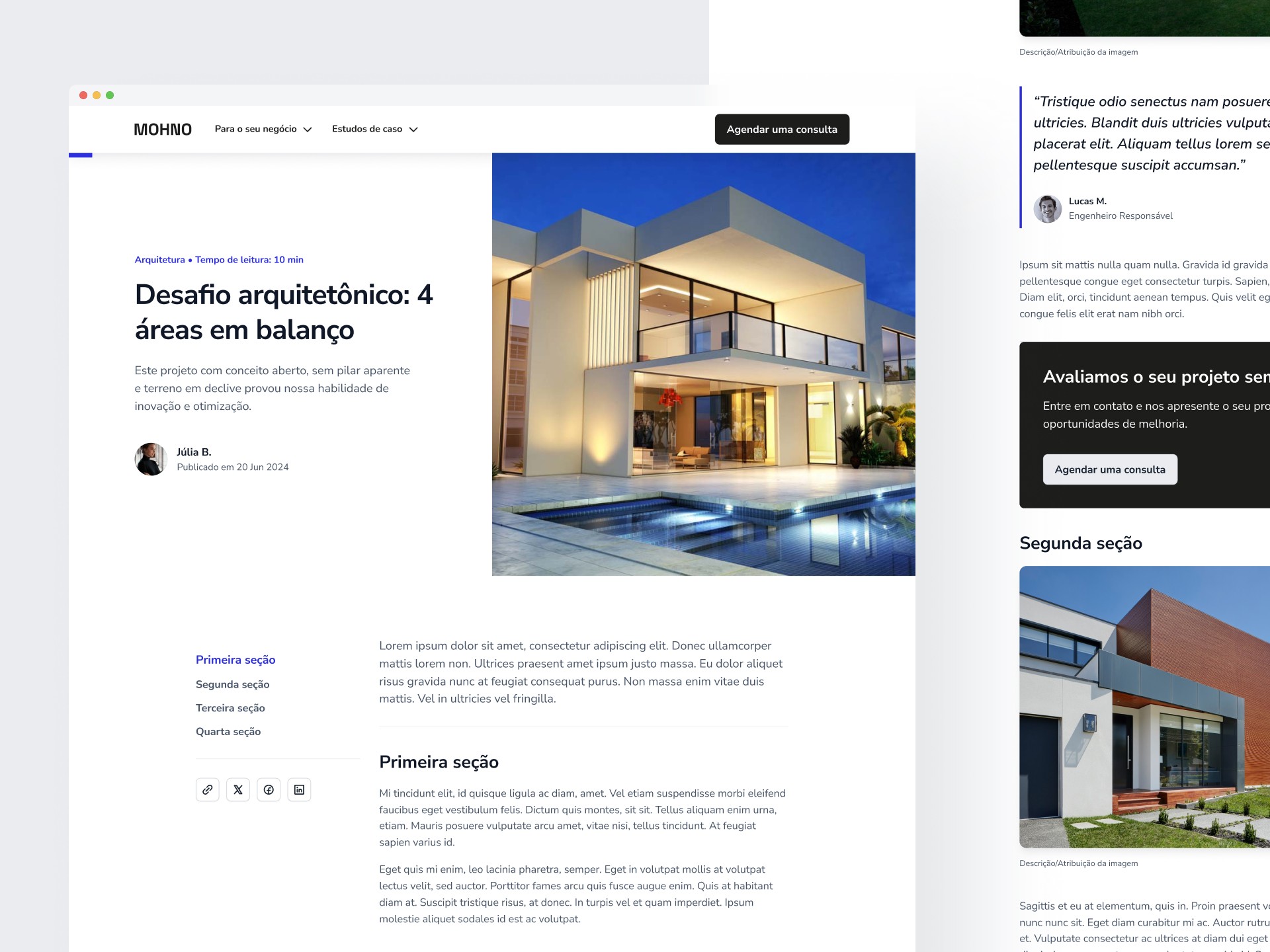
For the blog articles, I designed a modular, versatile page featuring a sleek, modern aesthetic. While keeping the clean visuals, I inverted the navigation colors to white—preserving a light, contrast-driven tone to underscore the distinction between fixed and dynamic content.
The page’s dynamic content is built with CMS best practices, enabling varied layouts. On the left, a content index serves both navigation and quick access, along with rapid share links.
Between text sections, a free evaluation CTA appears, followed by a newsletter signup. Additionally, a related articles gallery concludes the page.
404 page
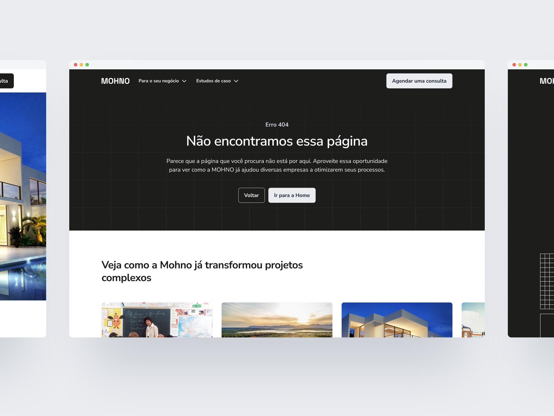
The 404 page repurposes featured articles to re-engage users—boosting bounce prevention and improving potential conversions.
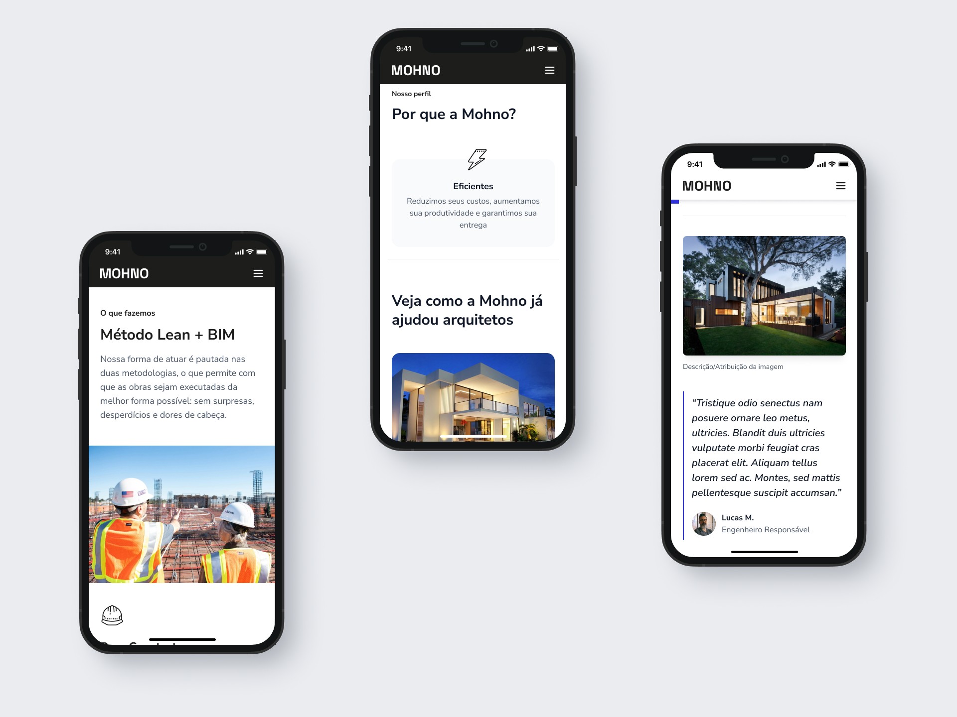
Mobile
This responsive approach leverages a modular framework—ensuring seamless transitions across devices without costly redesigns.
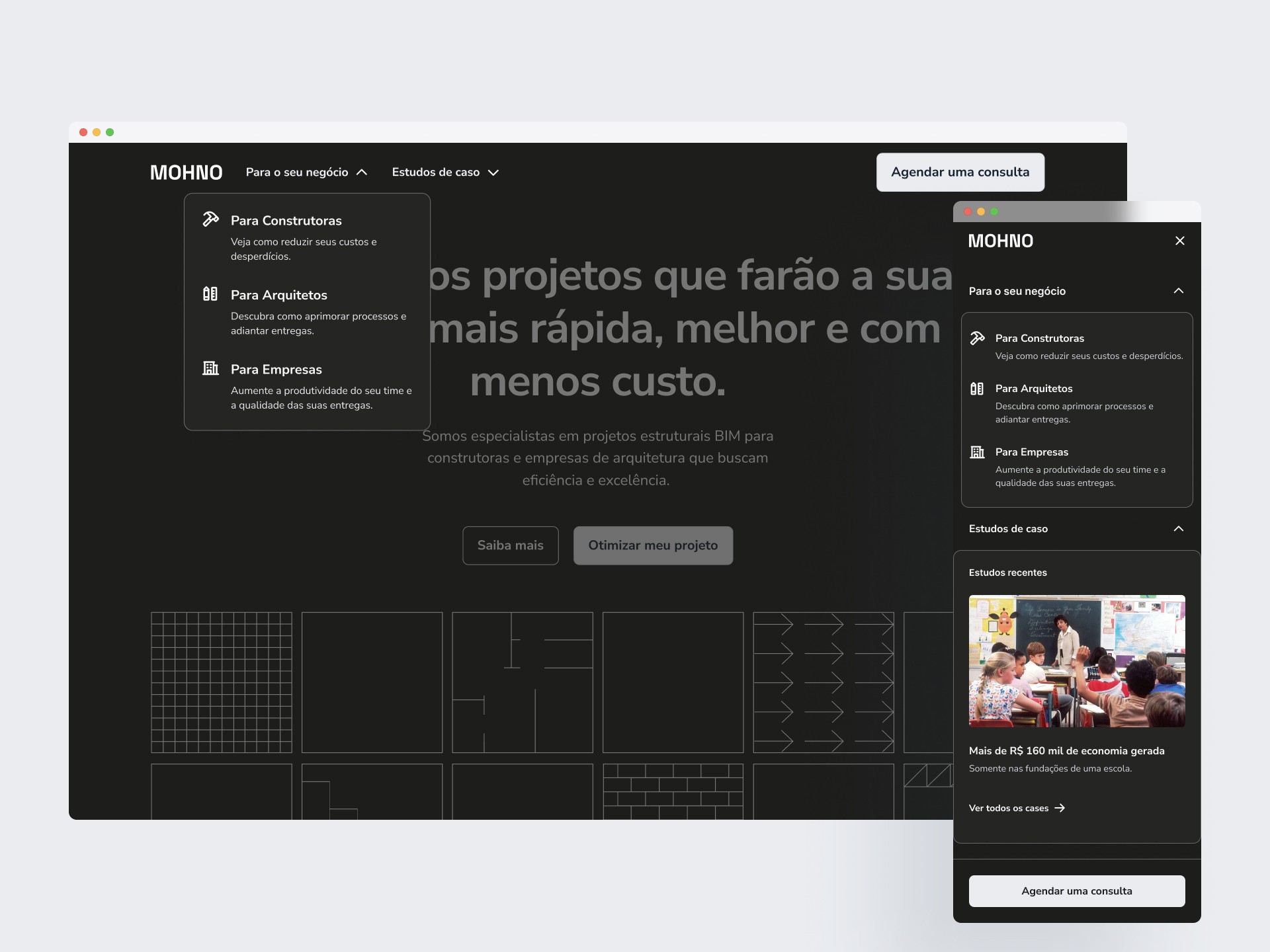
Navigation
The page elements were adjusted by reducing opacity to prioritize navigation visibility. On the mobile navigation, the “Recent articles” section displays the last 3 articles—though reduced in size for demonstration purposes.
The navigation includes a floating menu with quick links to the company’s client segments, followed by featured blog posts and a free evaluation scheduling CTA.
The page elements were adjusted by reducing opacity to prioritize navigation visibility. On the mobile navigation, the “Recent articles” section displays the last 3 articles—though reduced in size for demonstration purposes.
This enhanced navigation adds a read progress bar, improving engagement metrics for longer content sessions.
Style Guide
Typography
Colors
To enhance visual flexibility, I expanded the brand palette from initial tones to a more inclusive color grade—paired with a new grayscale series to support accessibility and tonal balance.
Neutrals
AAA 21.1
White
#FFFFFF
AAA 21:1
Black
#000000
Grays
AAA 7.49
25
#FCFCFD
AAA 7.35
50
#F9FAFB
AA 6.97
100
#F2F4F7
AA 6.49
200
#EAECF0
AA 5.21
300
#D0D5DD
2.58
400
#98A2B3
AA 4.95
500
#667085
AAA 7.65
600
#475467
AAA 10.41
700
#344054
AAA 16.02
800
#182230
AAA 17.79
900
#101828
AAA 18.84
950
#0C111D
Primary
AAA 7.36
25
#FAFAFA
AAA 7.05
50
#F5F5F5
AA 6.74
100
#F0F0F0
AA 5.82
200
#E0E0E0
AA 4.54
300
#C7C7C7
2.84
400
#999999
3.94
500
#808080
AA 5.74
600
#666666
AAA 8.45
700
#4D4D4D
AAA 12.31
800
#353531
AAA 16.88
900
#1D1D1B
AAA 19.21
950
#0E0F0D
Secondary
AAA 7.70
25
#F9F9FE
AAA 7.31
50
#F2F3FD
AA 6.55
100
#E5E6FB
AA 5.55
200
#D3D3F8
AA 4.60
300
#BEBFF5
3.08
400
#9698EE
AA 4.68
500
#6264E6
AAA 8.14
600
#2D30DD
AAA 10.32
700
#2629B1
AAA 13.05
800
#1F2184
AAA 15.81
900
#181A58
AAA 18.33
950
#11122B
Iconography


Spacings
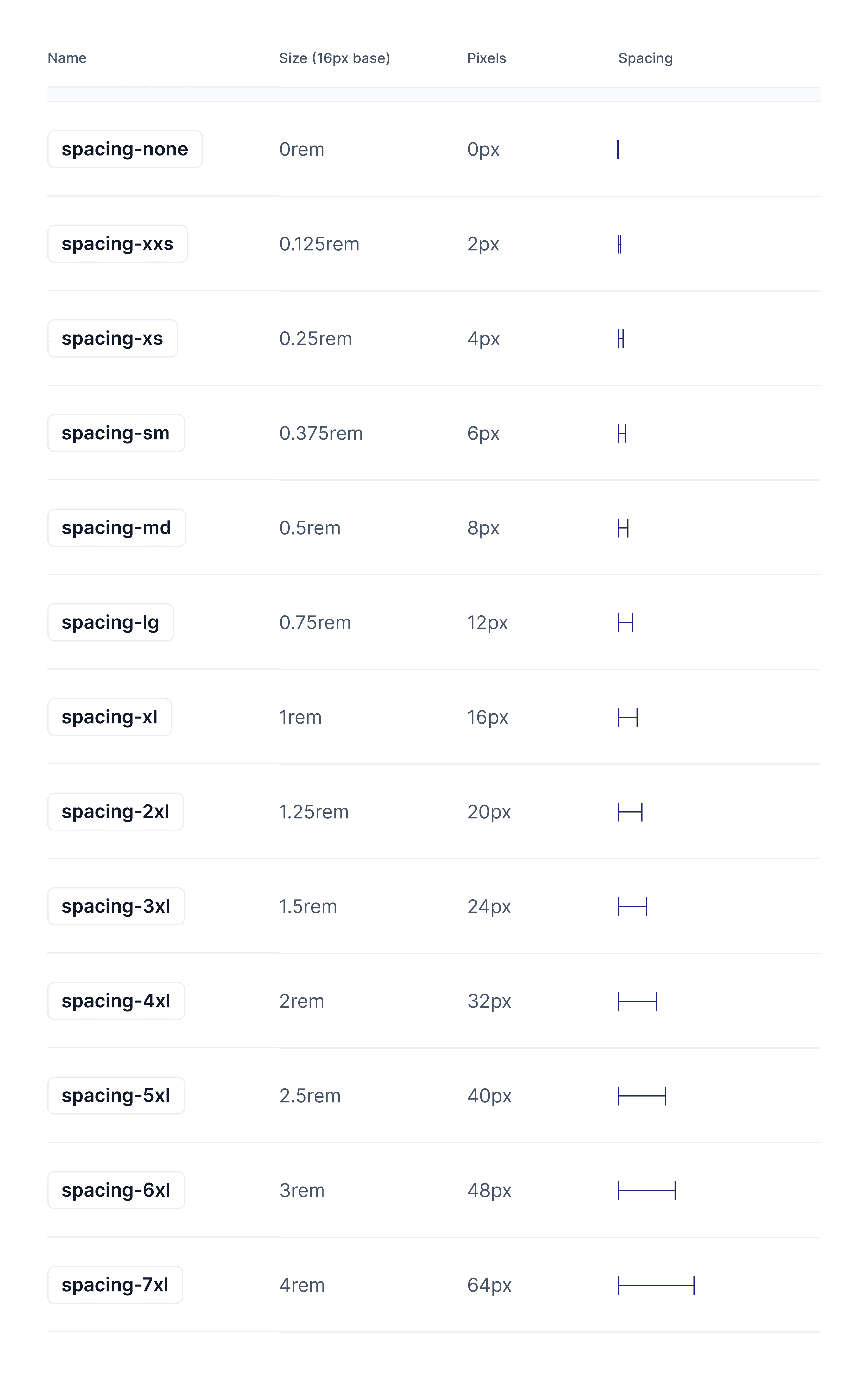
Spacings, radius, paddings and margins follow an 8 point grid.
Prototype
Below are two wireframes that reflect my vision for the client. Due to dimension constraints, some screens may not display them correctly. In that case, please click the button below to access the full-resolution prototypes.
Proposed design
Final thoughts
This project represented the pinnacle of my creative exploration. I particularly enjoyed the document inspired architecture design, which resonated deeply with the client's vision. The main challenge was bridging the tangible, on-site essence of construction to a digital, remote-first experience.
Here, I also advanced my Ul/UX skills, leveraging Framer to prototype the design quickly. The client's satisfaction was evident-though their decision was to go with a simpler design, it left me hopeful for future contributions to the company's growth.
The final delivery took place in late June, with the deployment pending from the developer. I'm genuinely excited about the results, and I look forward to future collaborations.