Context
Completed
Freelance
Finance
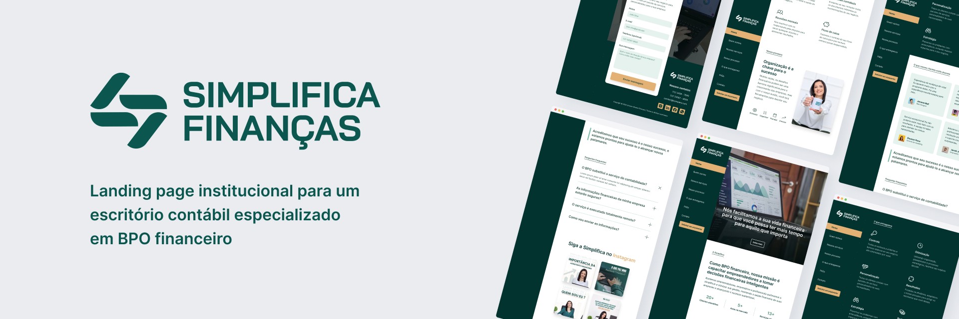
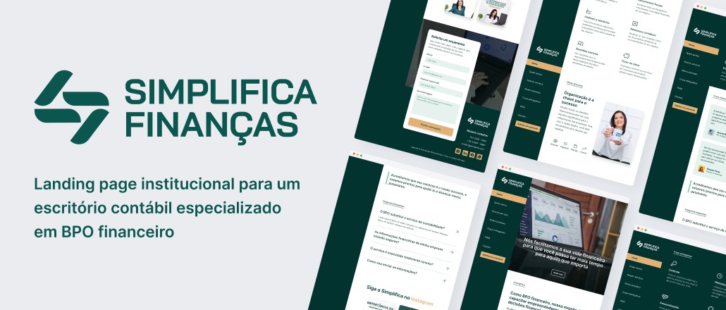
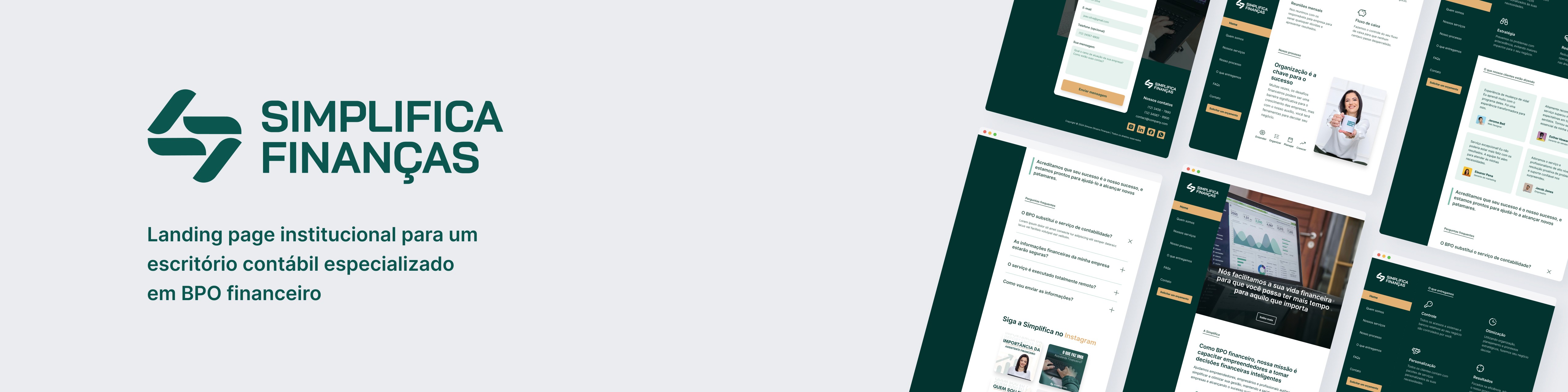
Landing page
Institutional
Market research
Copywriting
Benchmark
Wireframes
UI Design
Style guide
Prototype
Deliverables
Copywriting
UI Design
Prototyping
Project
Institutional website
Finance sector
One-page
Timeline
Feb. - Mar. 2024
Rio Grande do Sul
Brazil
Tools

Figma

Google Drive

Google Meet
Google Forms
Framer
Market research and competitor analysis
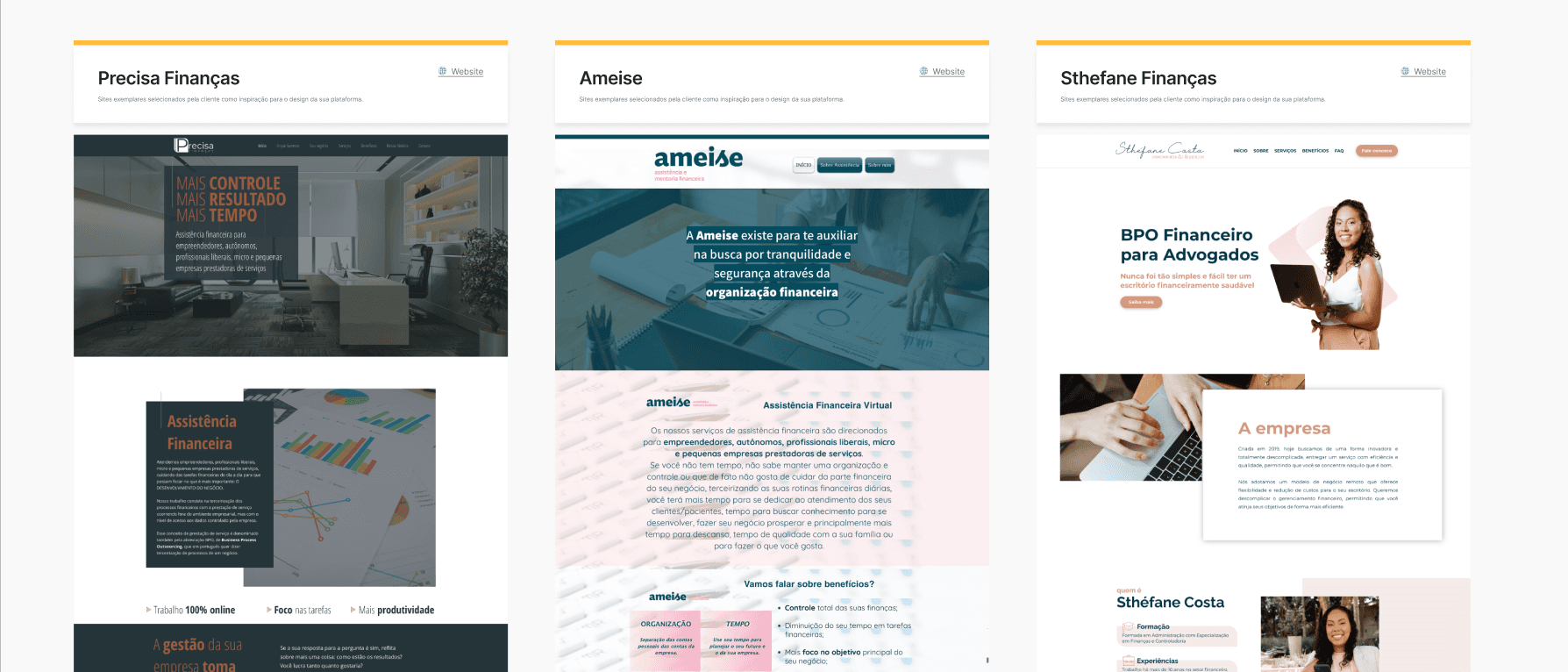
To grasp current market practices, I conducted a search of similar companies, observing recommendations from local competitors. I noticed that, despite the predominantly remote nature of the industry, only a few companies had an active online presence.
Some had lengthy, text-heavy websites, which posed a high cognitive load for potential clients. Others did not clearly outline the services they offered, making it difficult to access basic information.
User research
I developed a form with two questions to better understand how people discover new services and how they communicate with companies and service providers after making the choice. The form was created using Google Forms, and I secured participation from 23 people, including representatives from legal entities (business owners) and individuals.

Service discoverability
Regarding the method of discovery, aside from the options presented here to the side and the "others" option - where participants can provide a personalized response - I also included several social media platforms.
The majority of participants stated that they search for new products and services directly through search engines (mainly Google).
Following that, Instagram received 7 votes, and finally, 4 participants mentioned using personal references from acquaintances.
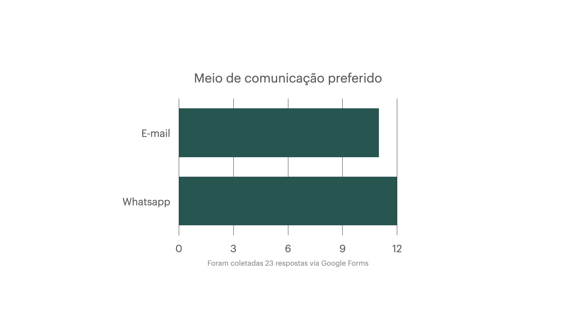
Direct contact
When asked about the preferred means of communication for getting in touch to learn more about a service or product, the majority of participants stated that they prefer WhatsApp, due to its practicality.
Second, the participants stated that they prefer email, as it represents a more formal medium and allows for the forwarding of information and messages within a professional environment, among different sectors.

The initial research shows the need for an active online presence, as well as the opportunity to present the commercial proposal through an institutional website dedicated to the service.
Wireframes
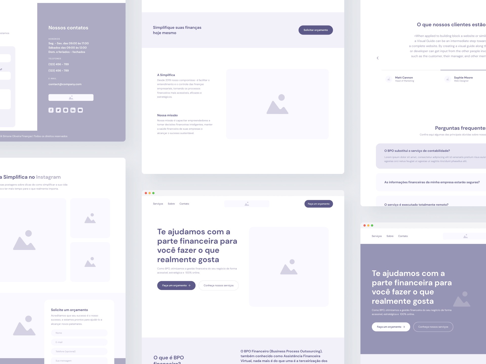
Having defined the initial idea of the project, I created the wireframes, keeping the client's requirement of presenting the relevant content on just one page. In total, six variations of layout were created.
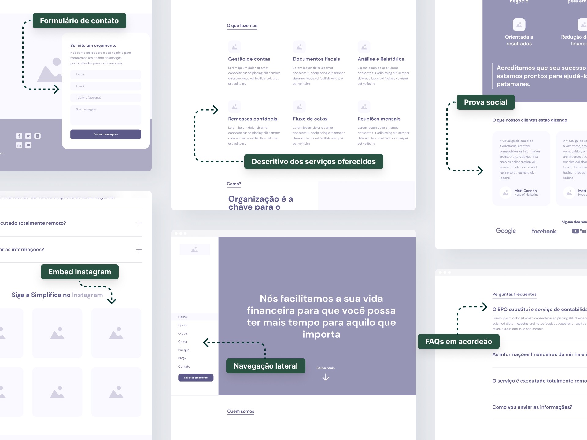
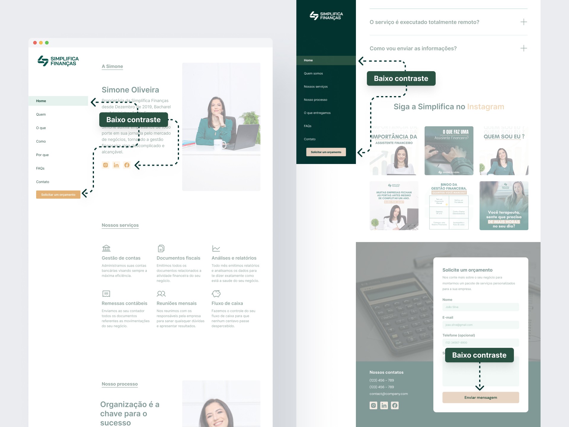
To stand out from competitors, I chose a side navigation—a distinctive, less traditional approach—highlighting how the design ethos differentiates the company in a crowded market. Additionally, I implemented a sticky scroll mechanism at the top of each section, ensuring users engage deeply focused in one section at a time—boosting clarity and engagement while aligning with modern UX best practices.
Visual design
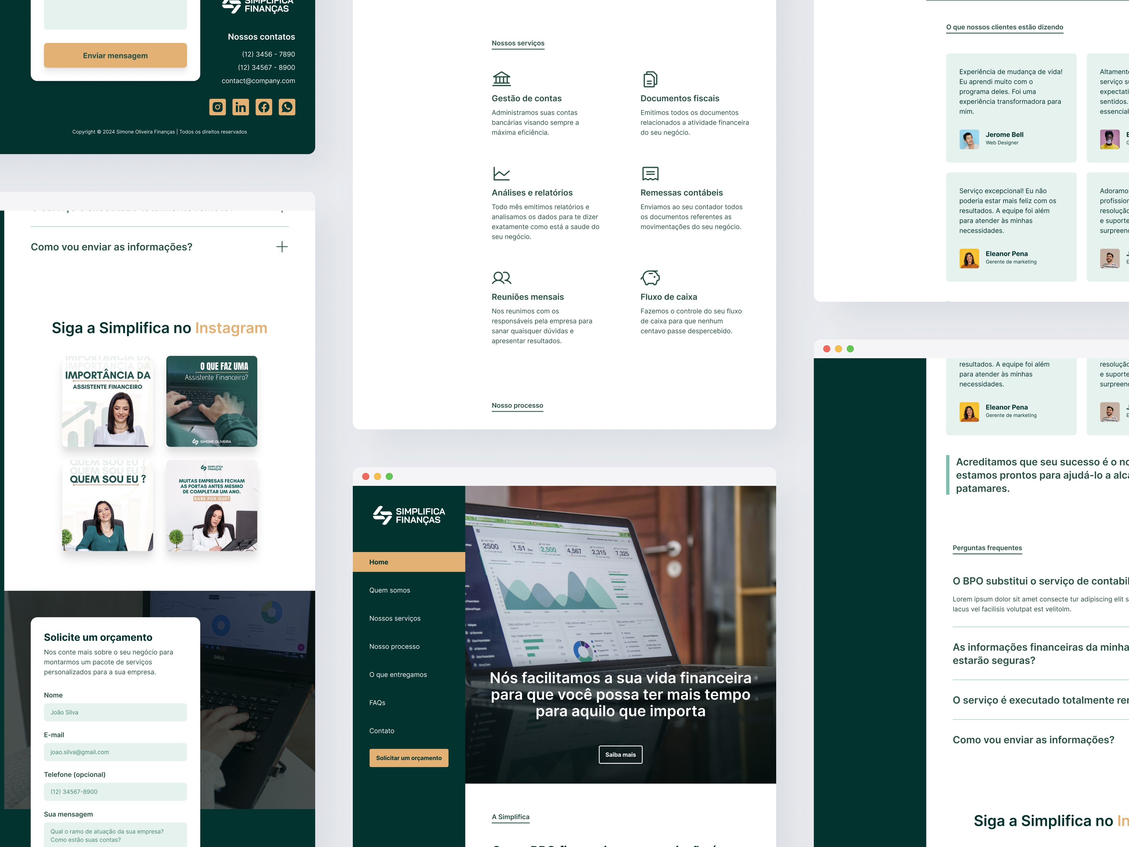
With the project’s structure finalized and approved, I proceeded to apply the client’s visual identity, incorporating the provided assets—images and graphics. To ensure consistency and efficiency, I selected a typography font family and icon set that reinforced and complemented the client’s brand identity, aligning the visual experience with the business strategy.
Iterations
During the initial iterations, I tested and refined the brand color palette to ensure visual harmony while maintaining optimal contrast for key elements—including CTAs, buttons, and navigation menus. This step ensured accessibility, usability, and a professional aesthetic that aligns with the client’s brand guidelines.
The initial colors defined by the client wouldn't work for text content, as the contrast ratio was too low to pass WCAG standards. I leveraged tools like Coolors to iterate on the palette, testing variations to guarantee inclusive contrast (WCAG compliance) for users with visual impairments, while keeping the color family from the client's stablished visual identity.
Hero
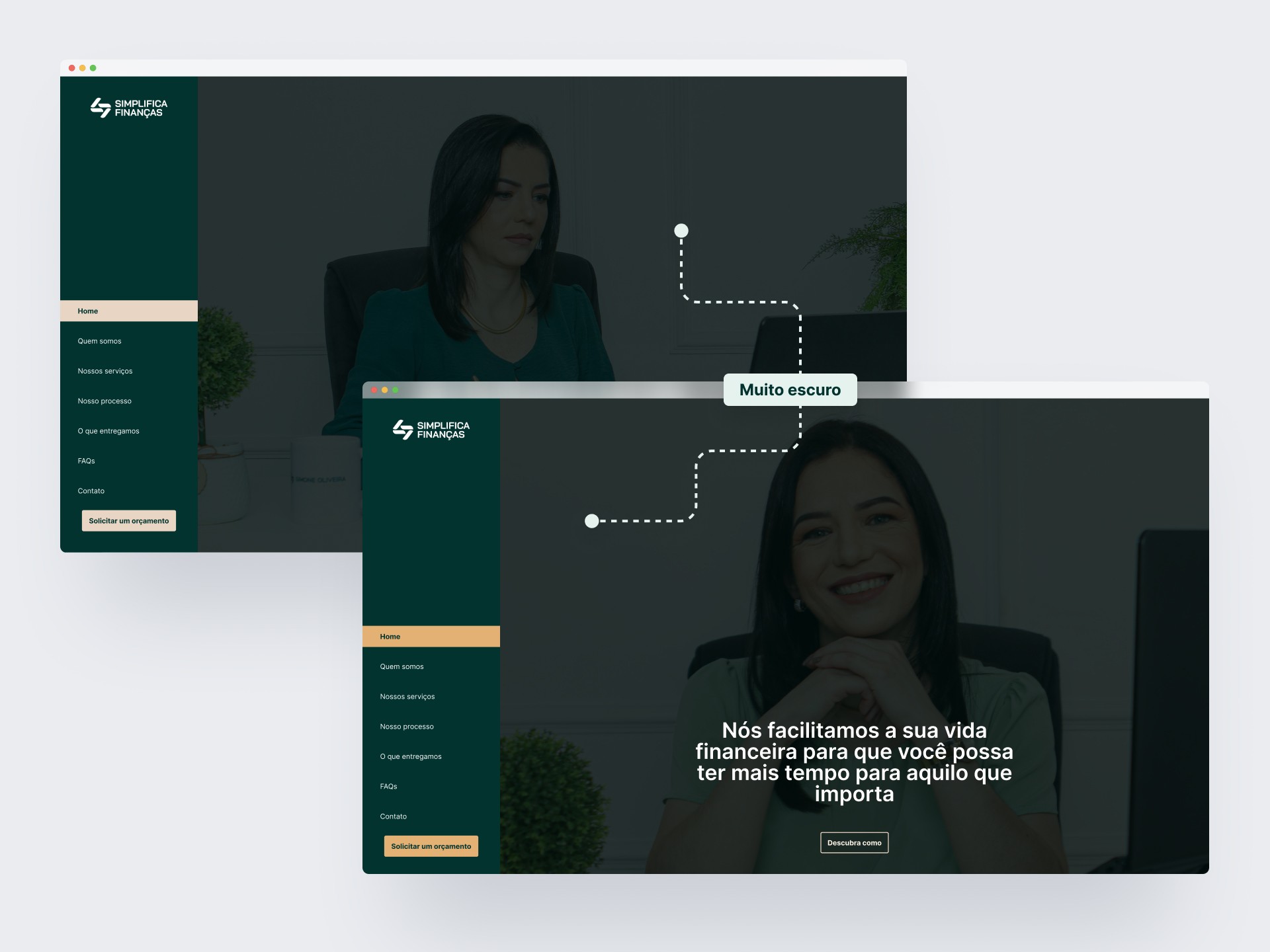
In the first iterations of the hero section, I intentionally deepened the color palette. Using darker tones to improve readability, while still maintaining brand consistency, helped the design achieve a 90% WCAG contrast ratio for critical elements.
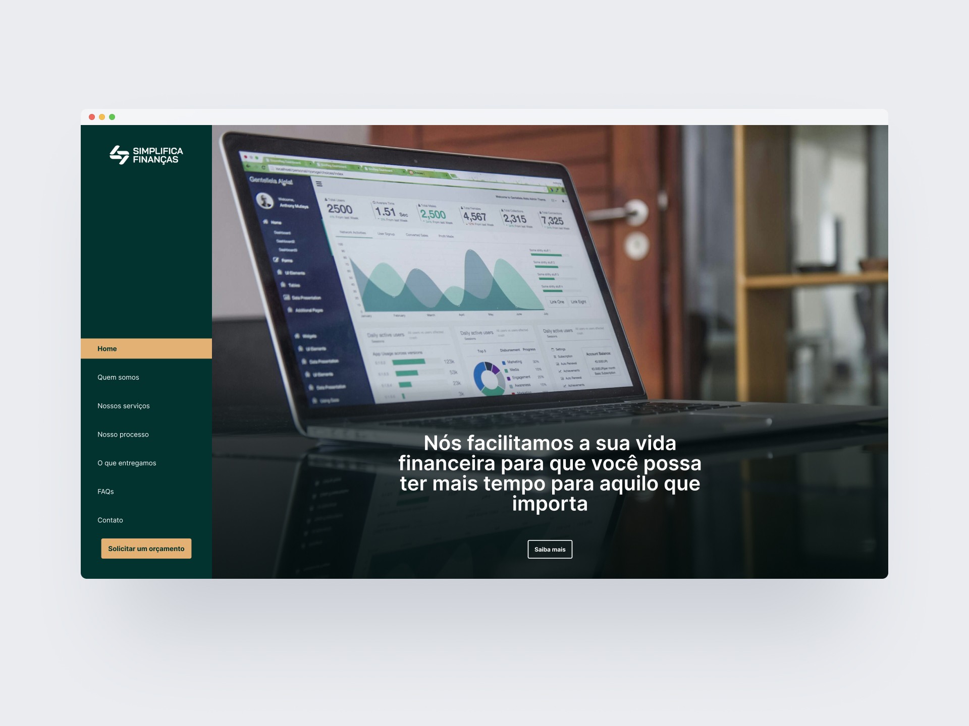
In the initial hero section iterations, I adjusted the color scheme to prioritize text legibility—dark backgrounds became a strategic choice to enhance readability, while ensuring alignment with the client’s brand tone.
Mobile

For the mobile version, I repositioned the CTA prominently in the header to ensure visibility, while strategically placing the contact form at the end of the page—optimizing screen space and user flow for better engagement. This design decision aligns with mobile-first principles, prioritizing quick actions and seamless navigation. Clicking the CTA will take the user to the footer where the form is located.
Style guide
Typography
Regular, semibold and bold
Colors
Grays
25
#FCFCFD
100
#F2F4F7
200
#EAECF0
300
#D0D5DD
400
#98A2B3
500
#667085
700
#344054
800
#1D2939
900
#101828
Primary
100
#E5F2EE
200
#B6E3D2
300
#7EBEAC
400
#5EB896
500
#519E82
600
#376B58
700
#376B58
800
#2A5243
900
#1D382E
Secondary
100
#FFF5E8
200
#F5E3CE
300
#E3C6A3
400
#E3B174
500
#C99D67
600
#B0895A
700
#7D6140
800
#634D33
900
#4A3A26
Iconography
Spacings
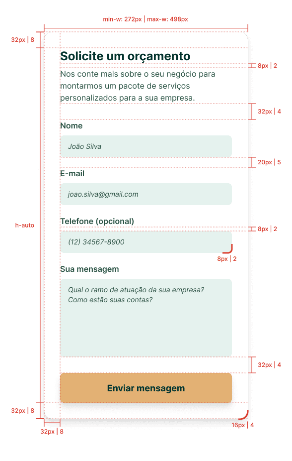
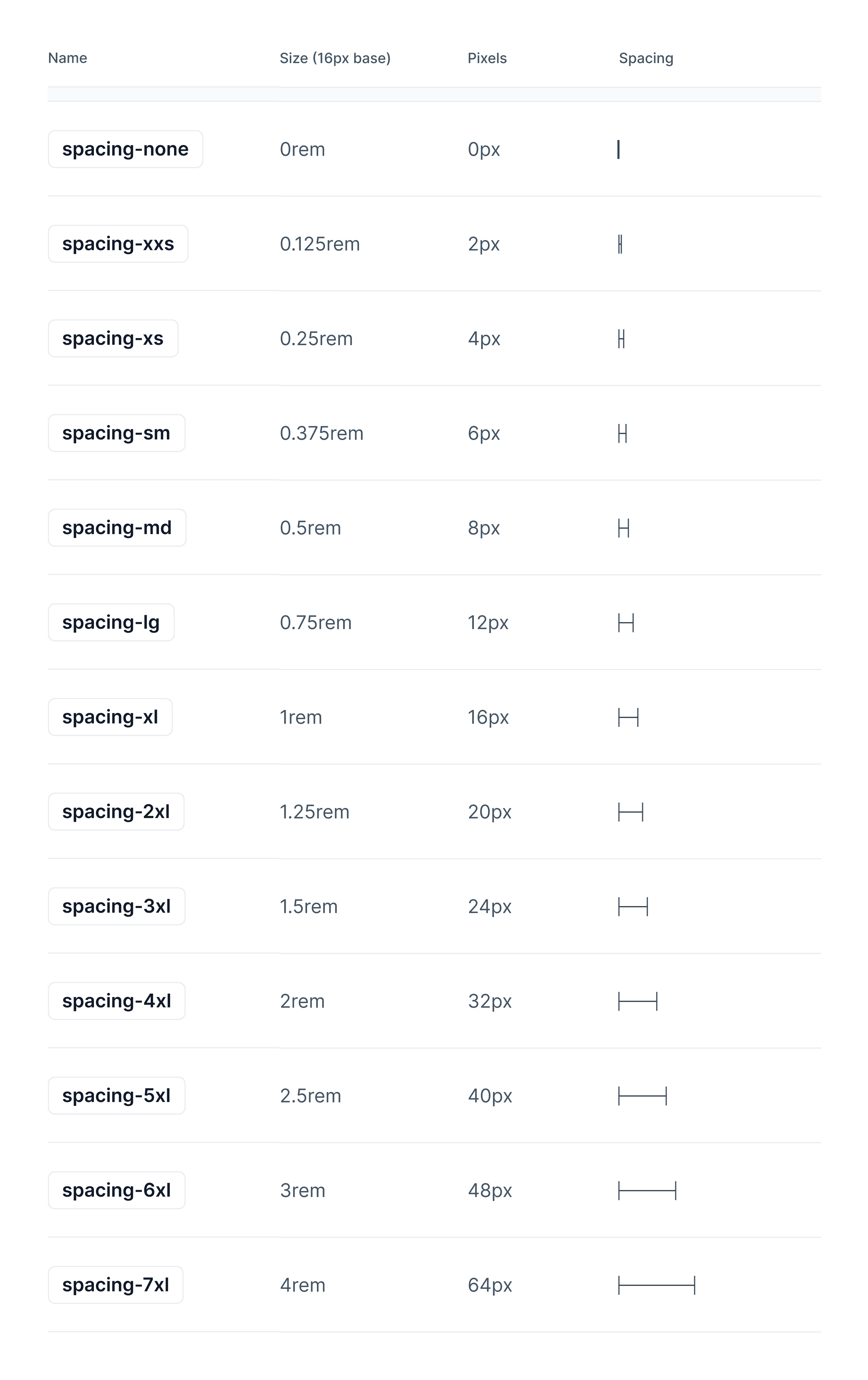
Spacings, radius, paddings and margins follow the 8 point grid.
Prototype
I’ve prepared a detailed prototype showcasing my approach. For optimal viewing, please use the high-resolution version linked in the button below .
Final thoughts
This was my first professional project involved designing a single-page website for a tax accounting firm, in line with their brand’s identity to quickly build their online credibility. The handoff process to the front-end developer ensured smooth technical integration. Reflecting on this project, I’ve learned to prioritize:
• Simplicity: Reducing client form complexity to just an email capture for lead automation, improving engagement rates.
• Technical Collaboration: Directly passing project requirements to developers to streamline execution.
• Future-Proofing: Recognizing the potential of WhatsApp chatbots as an initial user engagement tool, though not implemented in this project.
This experience highlighted the importance of balancing design constraints with user-friendly functionality—a skill I continue to develop in UX/UI.