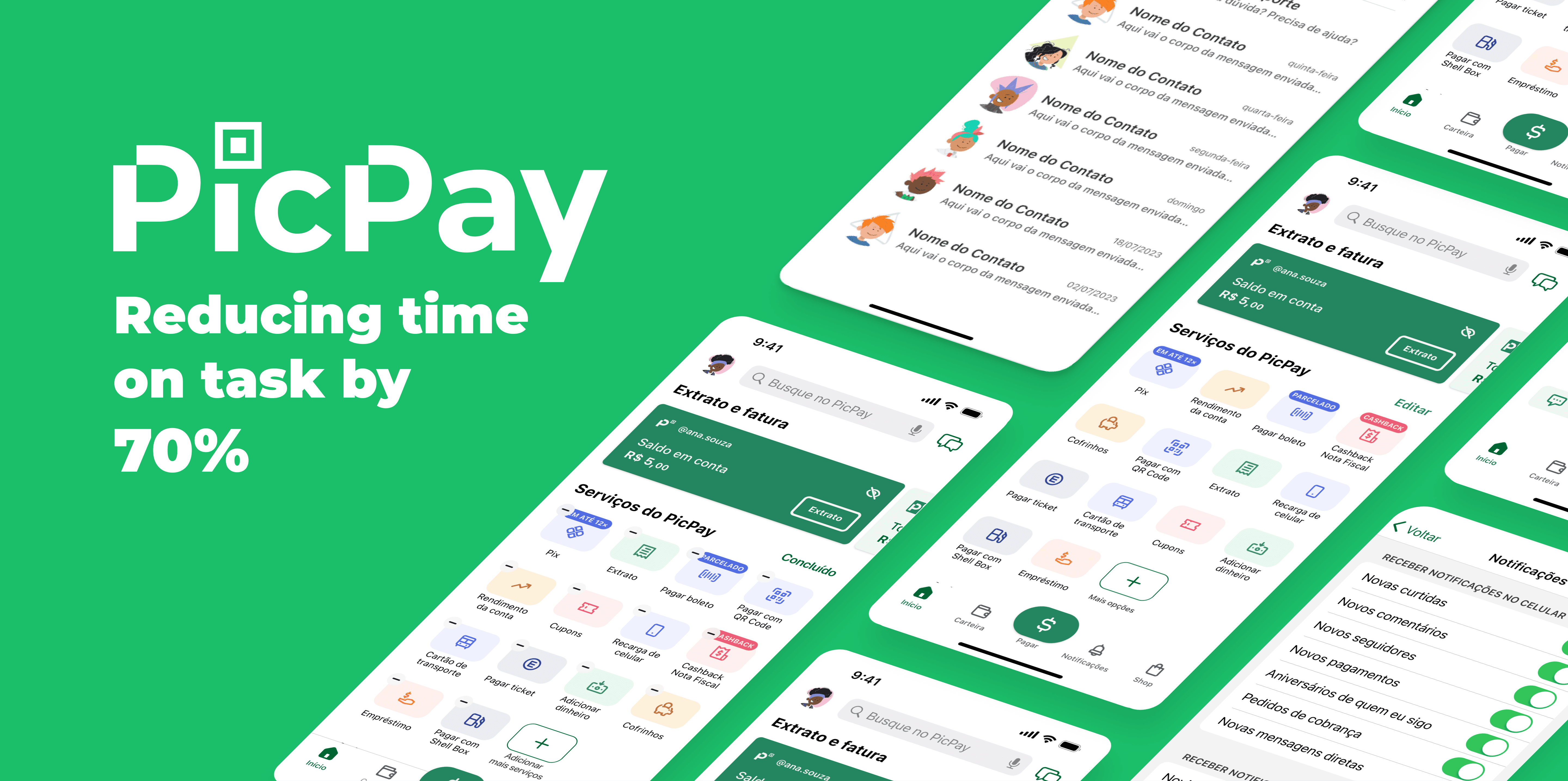
Context
This case study was developed within 48 hours as a way to challenge the skills I had acquired up to that point, as I hadn't yet put together any projects for my portfolio. I had a few planned ideas, but my portfolio was still under construction. However, I received a job opening ad for a well respected company, and I decided to take on this challenge. It was time to put everything I had learned to the test.
Problem
Through the analysis of app store reviews, I noticed that the biggest pain point for users is the high cognitive load caused by the app's interface, which displays a lot of information right on the home screen, making it difficult for users to access the most commonly used services.
Furthermore, there is a flaw in the information architecture that makes it difficult to get help, both through chat bots and human based assistance, like phone calls or even chatting with an actual human.
Solution
The proposed solution is a redesign of the app's home screen, in accordance to Hicks's Law, reducing the user's cognitive load and the addition to interface customization, so that each user only sees the services they use the most displayed in their home screen.
Moreover, there's the addition of a fixed support channel within the messages screen. This way, all the tickets opened by users will remain in the same, easily accessible, place along with the inclusion of shortcuts to help portals right on the home screen.
Tools
Figma
Apple Notes
Useberry
Roles
Research
Visual design
Prototyping
Timeline
Project: 48 hours
Research: 9 hours
Design: 34 hours
Tests: 5 hours
Team
1 UI/UX Designer
1 Designer UI/UX
My Design Process


Imersion
Demographics
As it's not possible to access the demographics for the PicPay app, by analogy, we can use the data based on the website picpay.com obtained from the similarweb portal, which provides metrics for web pages. Through this data, we can create a persona that represents the target audience.
Gender distribution
Women 43.69%
Women 43.69%
Women 43.69%
Men 56.31%
Men 56.31%
Men 56.31%
Age distribution
23.08%
23.08%
23.08%
35.75%
35.75%
35.75%
20.43%
20.43%
20.43%
11.24%
11.24%
11.24%
6.75%
6.75%
6.75%
2.73%
2.73%
2.73%
18-24
25-34
35-44
45-54
55-64
65+
Data obtained on July, 21st, 2023 via https://www.similarweb.com/website/picpay.com/
Persona

Ana Souza
27, Junior Architect
27, Junior Architect
27, Junior Architect
São Paulo, Brazil
São Paulo, Brazil
São Paulo, Brazil
"I like apps that help me complete my daily tasks without feeling like I need a course to decipher what the next step to take is."
"I like apps that help me complete my daily tasks without feeling like I need a course to decipher what the next step to take is."
"I like apps that help me complete my daily tasks without feeling like I need a course to decipher what the next step to take is."
"I like apps that help me complete my daily tasks without feeling like I need a course to decipher what the next step to take is."
"I like apps that help me complete my daily tasks without feeling like I need a course to decipher what the next step to take is."

Personal info
Education:
Bachelor's
Professional exp.:
4 years
Devices:
iPhone 12, Dell XPS

Tech familiarity
Tech familiarity

Low
Medium
High
High

About
Ana recently moved to São Paulo and is still adapting to her new routine. She works as a junior architect in a small architectural firm. She's passionate about interior design and architectural aesthetics. Despite being proficient in 3D modeling software, she doesn't have much experience with technology and prefers straightforward, visual apps that facilitate her daily activities.

Behaviors
Shares an apartment with a friend
Travels twice a month to visit her family
Drives to work
Has lunch in restaurants every day
Likes to go out with friends on the weekends

Objectives
Wants to be recognized at work
Wants to learn to how to invest money
Wants to make new friendships
Wants to be more sustainable
Wants to enroll in a postgraduate program
User Journey
An user journey map show us the process through which the user goes in order to complete their tasks within the app, as well as their expectations and emotions through their interaction with the product.

Context
Ana, an architect in São Paulo, needs to make a payment for the restaurant where she eats lunch every day. Her lunch break is almost over.
Expectations
Convenience and efficiency: making a simple and quick payment during peak hours.
Security: having her payment data protected by the app and assuring the transaction will be made to the correct recipient.
Preparing for lunch
Ana realizes it's lunchtime and heads to the restaurant.
Upon arriving at the restaurant, Ana places her order.
Her meal arrives quickly despite the peak hour.
Ana finishes eating and heads to the cashier.
Selecting the payment method
Ana opens the app and clicks on the "pay" tab.
Ana scans the QR code with her phone's camera.
The app takes a while to load the payment information and prompts her to enter the desired amount.
Ana chooses to pay with the available balance.
Confirming the payment
Ana checks the recipient's details and the payment date.
Ana confirms the details and clicks on "pay."
The app requests biometric authentication to confirm the transaction.
The app displays the payment confirmation screen.
Checking the receipt
Ana clicks on the option to access the receipt.
Ana shows the transaction receipt to the restaurant cashier.
The cashier confirms the payment, and Ana returns to the office.

I need to make this payment quickly, my lunch break is almost over!

Oof, it sure is taking its time to load the payment data.

Biometric confirmation makes me feel like my data is safe.

Well, that was quick! I can walk back to the office without any rush.

Empathy Map
Says
”I want an app that allows me to make quick payments”
”I wish there was an app that showed me what I need right from the start”
”I don't like apps with complex lingo, i enjoy simplicity”
Thinks
Am I gonna have any issues making the payment?
I hope peak hours don't affect the app's functionalities
It's so easy to pay with my phone without any cash
Does
Uses the app as a way to make easy and efficient payments
Tries new apps but ends up using the ones she's more comfortable with
Shares the services that help her complete day-to-day tasks
Feels
Anxious when she needs to learn how to work with a new system
Worried about the stability of the services she uses
Comforted by the security measures provided by the app

Definition
Affinity map - Negative reviews
Analyzing the negative reviews for the PicPay app on the Apple App Store, Google Play Store, and Reclame Aqui platform, it's possible to extract accounts of experiences that negatively impact the user journey.
Busy interface
Busy interface, confusing navigation, excessive information and difficulty to access the most frequently used services, represent most of the reviews analyzed.
"Navigation is not simple"
"Leaves room to improve when it comes to searching for services"
"Too much information, it's not intuitive"
"Layout should be more practical"
"Bloated screen makes it difficult to find what we want quickly"
”Bloated and confusing interface”
Difficulty to contact support
The second most commented theme is the difficulty to directly contact support. There's the automated chat bot option, but even that is not easily accessible, with the "talk to a human representative" option hidden within the menus.
"Doesn't have a channel to talk to a human representative"
"Can't find a phone number to talk to support"
"Lacks a support channel to send technical information"
"There isn't a channel to talk directly to a human representative"
Excessive messages and notifications
Excessive push notifications sent to the user, pop-up messages within the app's screens and irrelevant information presented inopportunely represent the third most commented theme.
"Excessive ads and notifications for the app's own features"
"Excessive ads via notifications and chat messages"
"App's own ads get in the way of its features"
"Too many useless pop-ups and notifications"
"Keeps showing the same notifications, getting in the way of regular usage"
Insights
Sythesizing the information collected by the desk research above, we can identify opportunities for improving the app's user experience.
Simplify the home screen interface
Allow customization of the services displayed on the home screen
Cut back on marketing information, ads and messages
Facilitate the access to human based support

User Flows
Current support access flow - Via settings

Current support access flow - Via more options
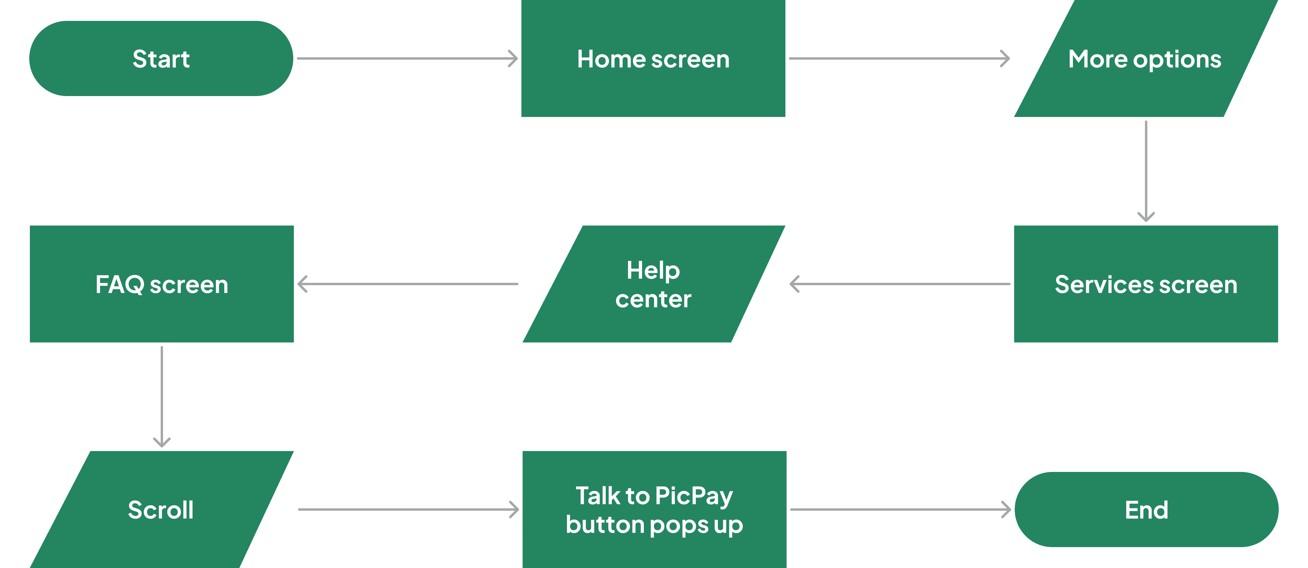
Proposed flow - Via messages

Proposed flow - Via CTA banner

Current support access flow - Via settings
Current support access flow - Via more options
Proposed flow - Via messages
Proposed flow - Via CTA banner
Current support access flow - Via settings
Current support access flow - Via more options
Proposed flow - Via messages
Proposed flow - Via CTA banner
Current support access flow - Via settings
Current support access flow - Via more options
Proposed flow - Via messages
Proposed flow - Via CTA banner
Current support access flow - Via settings
Current support access flow - Via more options
Proposed flow - Via messages
Proposed flow - Via CTA banner
Current support access flow - Via settings
Current support access flow - Via more options
Proposed flow - Via messages
Proposed flow - Via CTA banner
Current support access flow - Via settings
Current support access flow - Via more options
Proposed flow - Via messages
Proposed flow - Via CTA banner
Current support access flow - Via settings
Current support access flow - Via more options
Proposed flow - Via messages
Proposed flow - Via CTA banner
Current support access flow - Via settings
Current support access flow - Via more options
Proposed flow - Via messages
Proposed flow - Via CTA banner
Current support access flow - Via settings
Current support access flow - Via more options
Proposed flow - Via messages
Proposed flow - Via CTA banner
Current support access flow - Via settings
Current support access flow - Via more options
Proposed flow - Via messages
Proposed flow - Via CTA banner
Current support access flow - Via settings
Current support access flow - Via more options
Proposed flow - Via messages
Proposed flow - Via CTA banner
Current support access flow - Via settings
Current support access flow - Via more options
Proposed flow - Via messages
Proposed flow - Via CTA banner
Current support access flow - Via settings
Current support access flow - Via more options
Proposed flow - Via messages
Proposed flow - Via CTA banner
Current support access flow - Via settings
Current support access flow - Via more options
Proposed flow - Via messages
Proposed flow - Via CTA banner
Current support access flow - Via settings
Current support access flow - Via more options
Proposed flow - Via messages
Proposed flow - Via CTA banner
Design
High Fidelity Prototype
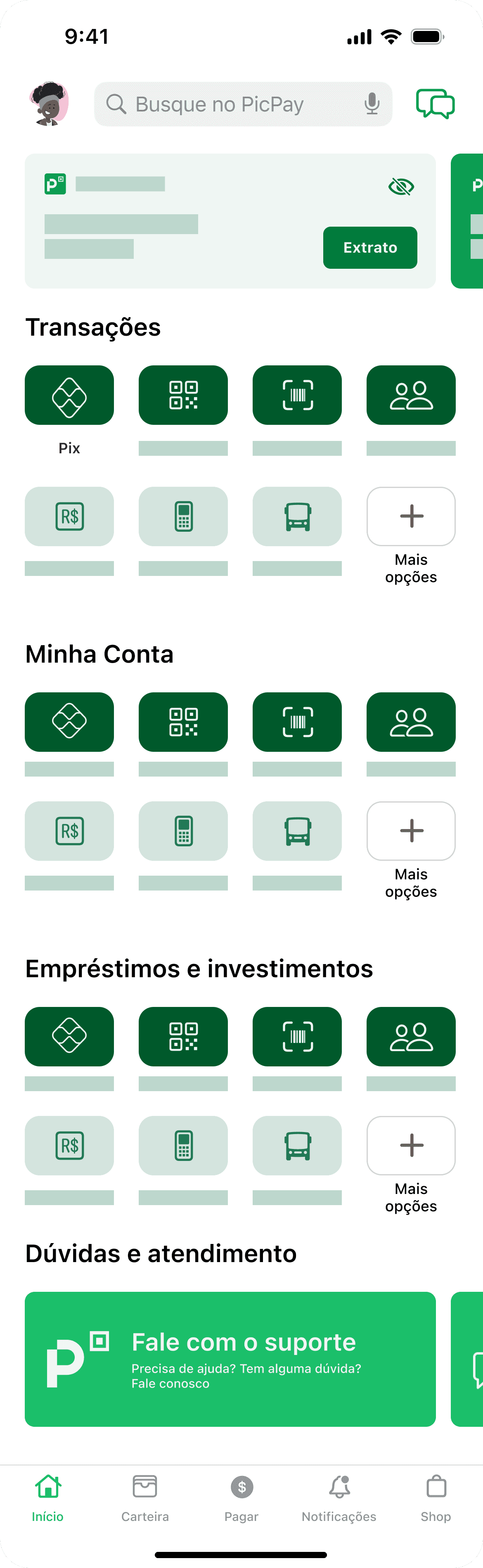
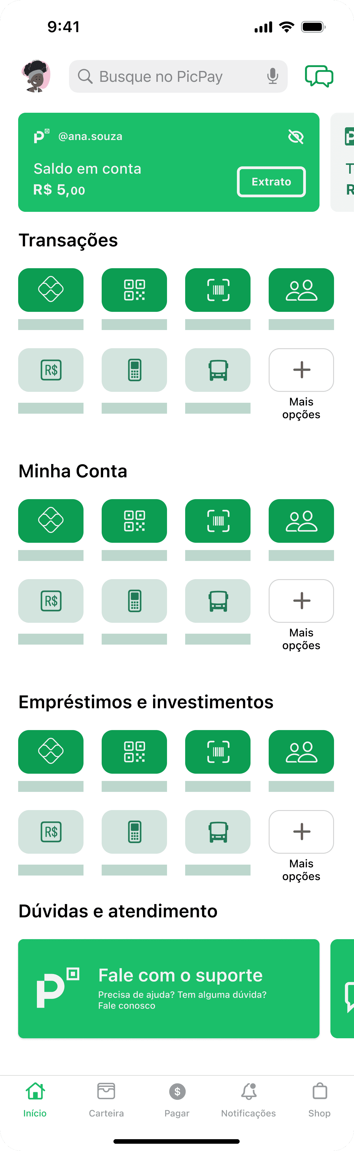
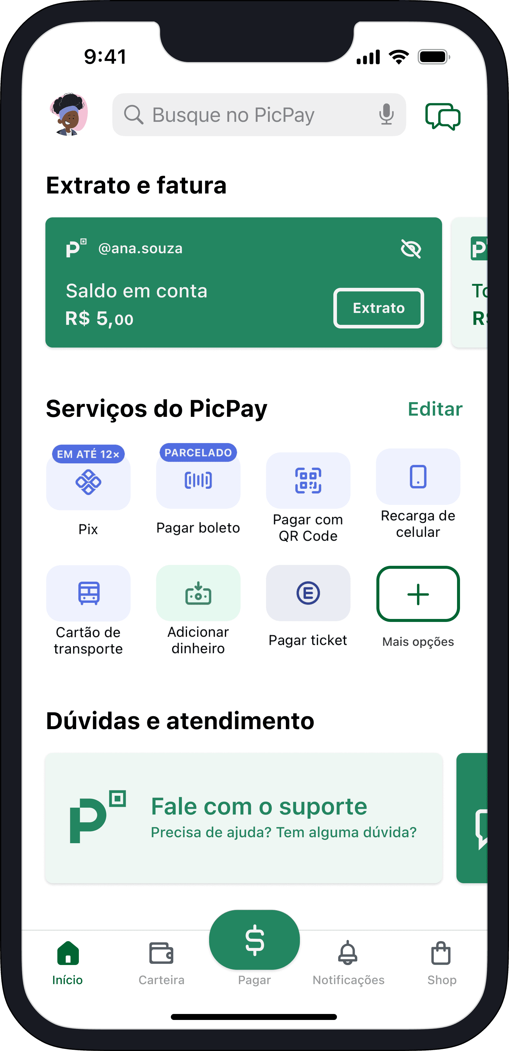
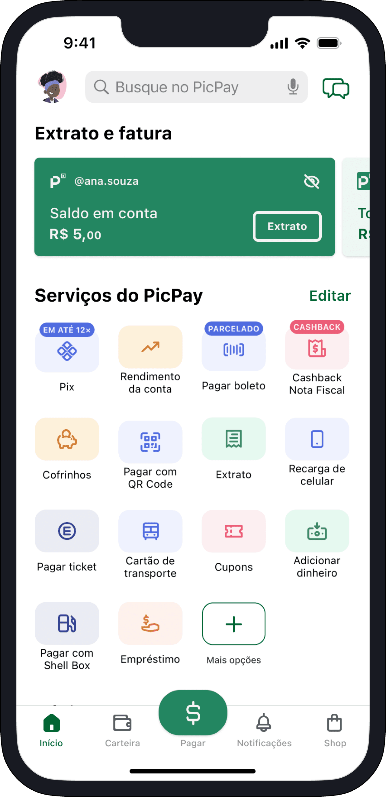
Home Screen
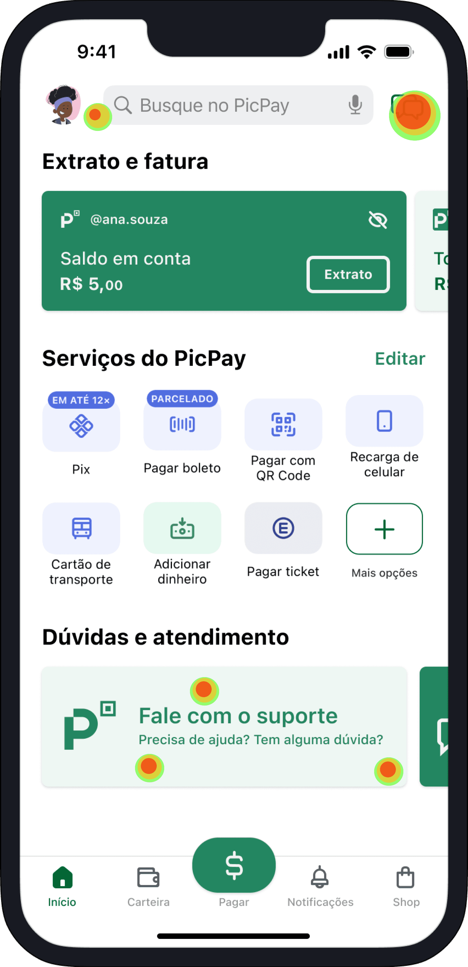
I opted to keep the home screen with a fixed height, displaying only the essential elements.
2
3
1
1
New edit button to customize which services get displayed in the quick access section.
2
The 7 most used services get displayed by default.
3
Contrasting banners allow for quick support access, improving discoverability.
The new home screen becomes compatible with WCAG 1.3.6 [AAA], by enabling user customization, allowing users to reduce the cognitive load of the interface if they wish.
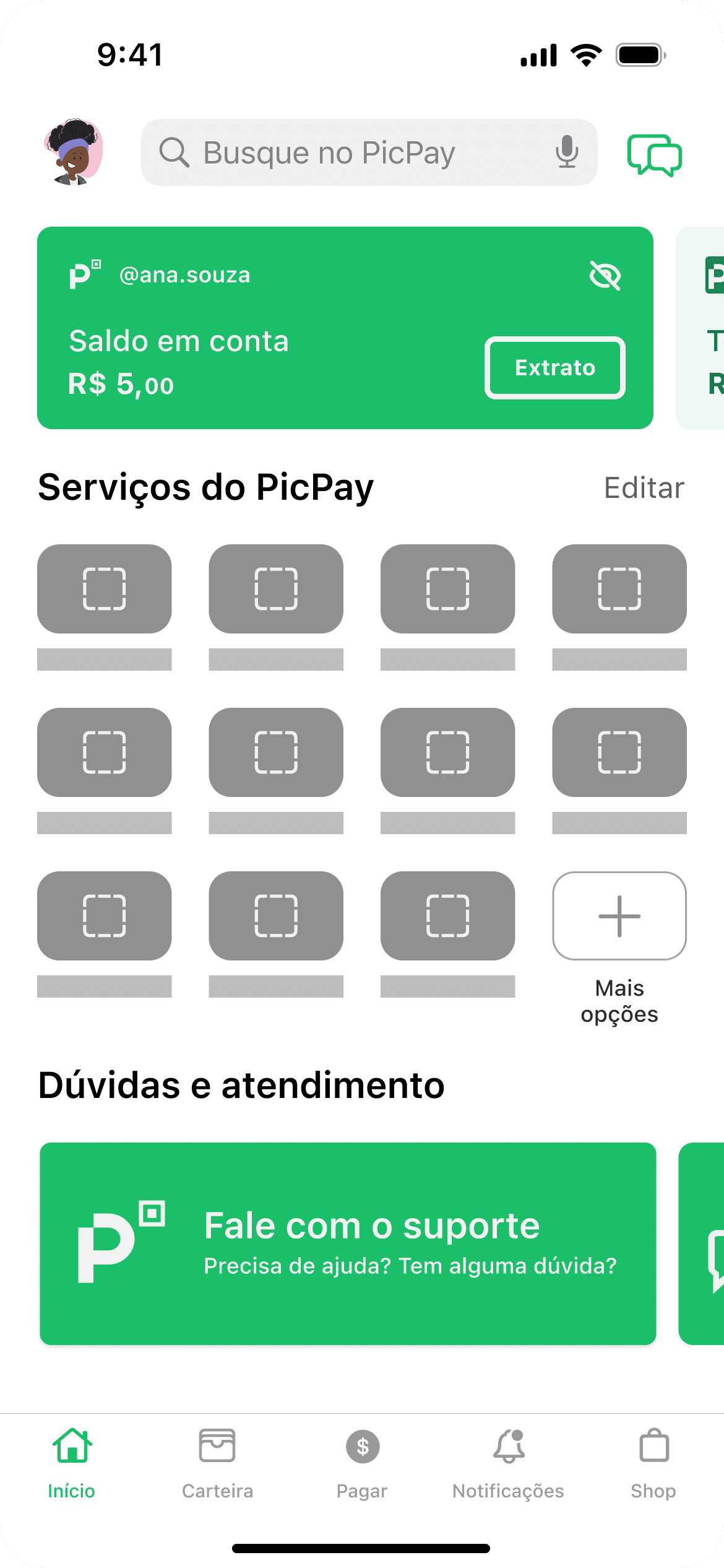
New Customization Sheet
Displays all available services and allows the user to select which ones to display on the home screen.

1
2
1
Follows the system pattern, allowing dismissal through swiping or clicking the cancel button.
2
Allows for service selection without any restrictions.
Compatible with WCAG 3.2.3 [AAA], facilitating the discoverability of a new feature by following system and app patterns.
Rearranging the icons
The user now may reorder de services as they see fit.

1
2
3
1
Only finishes the process when the user clicks on the "Concluído (done)” button.
2
Follows system patterns by wiggling the icons until the user finishes the process.
3
Allows adding more services if needed, returning to this screen before completing customization.
Compatible with WCAG 1.3.2 [A], Proposes a logical sequence of steps to perform the task and allows error correction.
Custom Home Screen
1
1
Now completely customized by the user, the home screen only displays the chosen services.
Inclusion of headers in accordance with WCAG 2.4.10 [AAA]
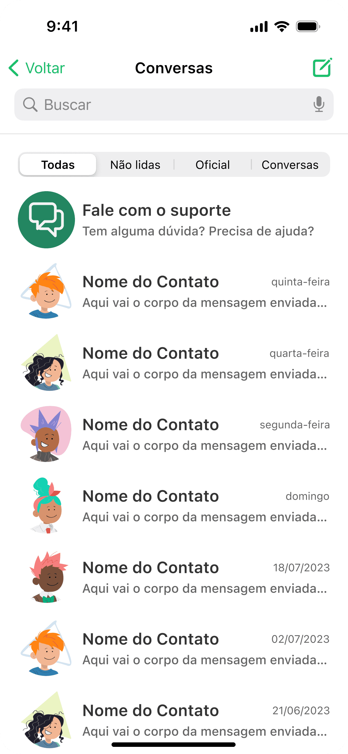
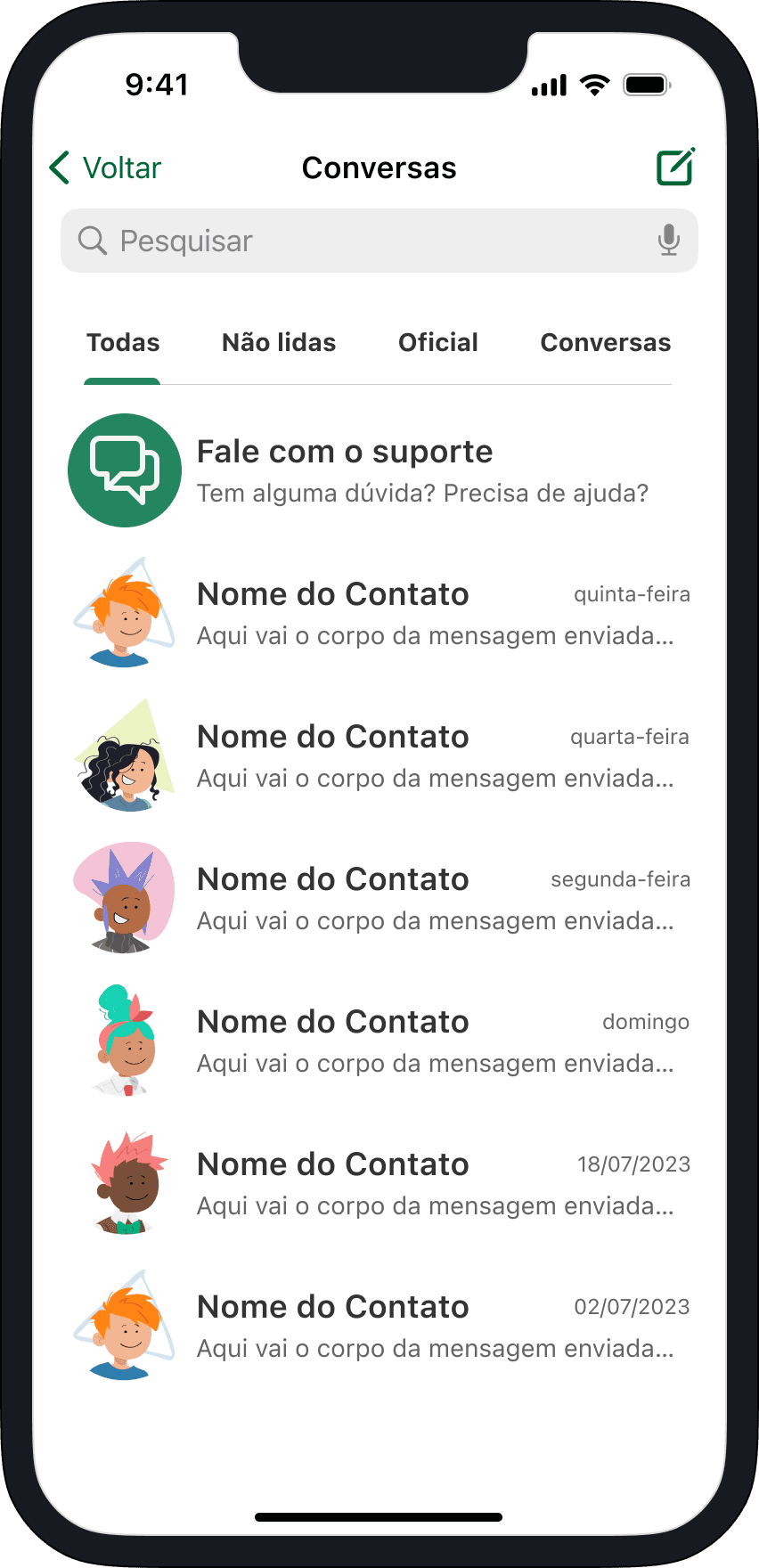
Novo Support Channel
1
2
3
1
Joins the existing official messages already sent by the company to users.
2
Keeps user filter options, displaying only direct messages if needed.
3
The chat screen now features a dedicated support channel. This chat keeps the user's entire ticket history, providing easy access.
Compatible with WCAG 3.2.6 [A] - Consistent help.
New Notifications Options

1
2
1
Settings broken in sections to facilitate user differentiation.
2
Marketing and pop-up sections added, to prevent these ads from being displayed during app usage.
Compatible with WCAG 2.4.10 [AAA]
Home Screen
I opted to keep the home screen with a fixed height, displaying only the essential elements.
2
3
1
1
New edit button to customize which services get displayed in the quick access section.
2
The 7 most used services get displayed by default.
3
Contrasting banners allow for quick support access, improving discoverability.
The new home screen becomes compatible with WCAG 1.3.6 [AAA], by enabling user customization, allowing users to reduce the cognitive load of the interface if they wish.
New Customization Sheet
Displays all available services and allows the user to select which ones to display on the home screen.
1
2
1
Follows the system pattern, allowing dismissal through swiping or clicking the cancel button.
2
Allows for service selection without any restrictions.
Compatible with WCAG 3.2.3 [AAA], facilitating the discoverability of a new feature by following system and app patterns.
Rearranging the icons
The user now may reorder de services as they see fit.
1
2
3
1
Only finishes the process when the user clicks on the "Concluído (done)” button.
2
Follows system patterns by wiggling the icons until the user finishes the process.
3
Allows adding more services if needed, returning to this screen before completing customization.
Compatible with WCAG 1.3.2 [A], Proposes a logical sequence of steps to perform the task and allows error correction.
Custom Home Screen
1
1
Now completely customized by the user, the home screen only displays the chosen services.
Inclusion of headers in accordance with WCAG 2.4.10 [AAA]
Novo Support Channel
1
2
3
1
Joins the existing official messages already sent by the company to users.
2
Keeps user filter options, displaying only direct messages if needed.
3
The chat screen now features a dedicated support channel. This chat keeps the user's entire ticket history, providing easy access.
Compatible with WCAG 3.2.6 [A] - Consistent help.
New Notifications Options
1
2
1
Settings broken in sections to facilitate user differentiation.
2
Marketing and pop-up sections added, to prevent these ads from being displayed during app usage.
Compatible with WCAG 2.4.10 [AAA]
Components
Avatars


Banners


Tabs


Message cells


Buttons


Colors
#333333
#333333
#333333
#333333
#646464
#646464
#646464
#646464
#A6A6A6
#A6A6A6
#A6A6A6
#A6A6A6
#F3F3F3
#F3F3F3
#F3F3F3
#F3F3F3
#016533
#016533
#016533
#016533
#238661
#238661
#238661
#238661
#EEF7F3
#EEF7F3
#EEF7F3
#EEF7F3
Typography
Title
Title
Title
Title
SF Pro Bold 20
Header
Header
Header
Header
SF Pro Bold 18
Label
Label
Label
Label
SF Pro Bold 16
Subtext
Subtext
Subtext
Subtext
SF Pro Regular 14
Body
Body
Body
SF Pro Regular 12
Icons


Spacing
4 pontos
8 pontos
12 pontos
16 pontos
20 pontos
32 pontos
48 pontos
64 pontos
Tests
The tests were conducted through the platform useberry, there were 8 participants ranging from 18 to 44 years old.
Current design's first click

2
1
1
The majority of the participants chose the chat icon, which currently does not lead to support.
2
Some participants clicked on the item "more options, which currently leads to support options.
Proposed design's first click
1
2
1
In the proposed design, again, the most clicked item was the chat icon.
2
Some participants clicked directly on the CTA banners.
Current design

1
3
2
1
All participantes finished the task through the settings flow, which can be accessed by clicking on the profile icon.
2
The chat icon had the same amount of clicks as the profile icon.
3
The second possible flow, "more options" was the least clicked item onscreen.
In the current design, only the profile and "more options" icons lead to support.
Proposed design

1
2
3
1
The participants clicked on both the profile icon and the "more options" item, but since these functionalities already exist in the current app version, for the duration of the tests, they were disabled.
2
Most participants finished the task through the chat screen, using the new fixed support channel.
3
Just a few participants clicked on the call to action banners.
6 out of 8 participants finished the task through the chat flow and the other 2 finished it through the CTA banners.
Current design's first click
2
1
1
The majority of the participants chose the chat icon, which currently does not lead to support.
2
Some participants clicked on the item "more options, which currently leads to support options.
Proposed design's first click
1
2
1
In the proposed design, again, the most clicked item was the chat icon.
2
Some participants clicked directly on the CTA banners.
Current design
1
3
2
1
All participantes finished the task through the settings flow, which can be accessed by clicking on the profile icon.
2
The chat icon had the same amount of clicks as the profile icon.
3
The second possible flow, "more options" was the least clicked item onscreen.
In the current design, only the profile and "more options" icons lead to support.
Proposed design
1
2
3
1
The participants clicked on both the profile icon and the "more options" item, but since these functionalities already exist in the current app version, for the duration of the tests, they were disabled.
2
Most participants finished the task through the chat screen, using the new fixed support channel.
3
Just a few participants clicked on the call to action banners.
6 out of 8 participants finished the task through the chat flow and the other 2 finished it through the CTA banners.
Metrics
Current flow
4 clicks
Average time on task: 50s
Proposed flow
2 clicks
Average time on task: 15s
Reduction
50% on number of clicks
50% on number of clicks
70% on time on task
70% on time on task
70% on time on task
Next iterations
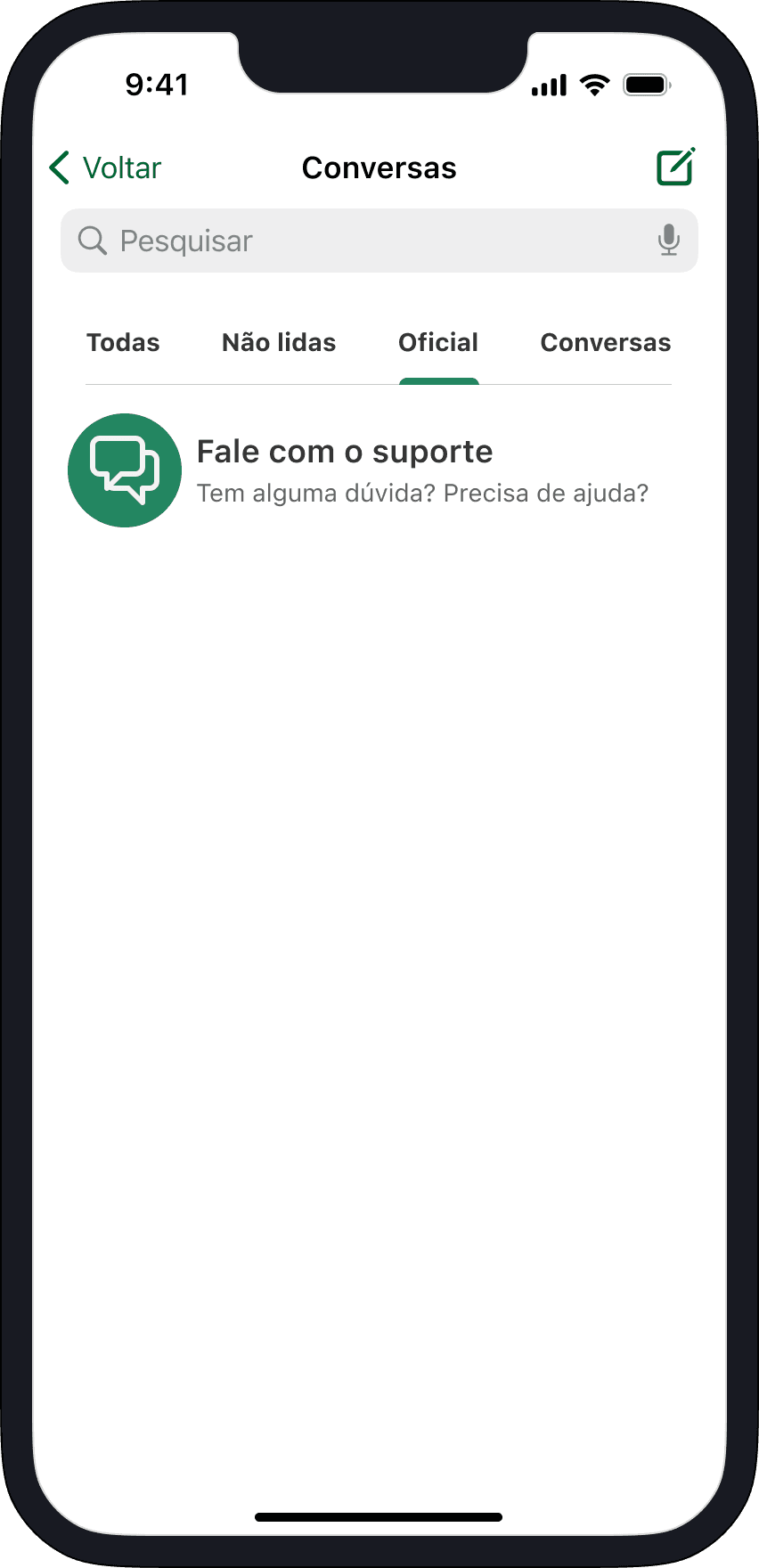
The decision to include a dedicated support access channel was the right choice, as in both tests and both flows, the message icon was the most clicked item onscreen.
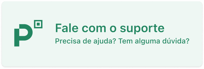
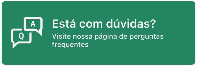
Only a few participantes clicked on the call to action banners. On a future iteration, it could be removed.
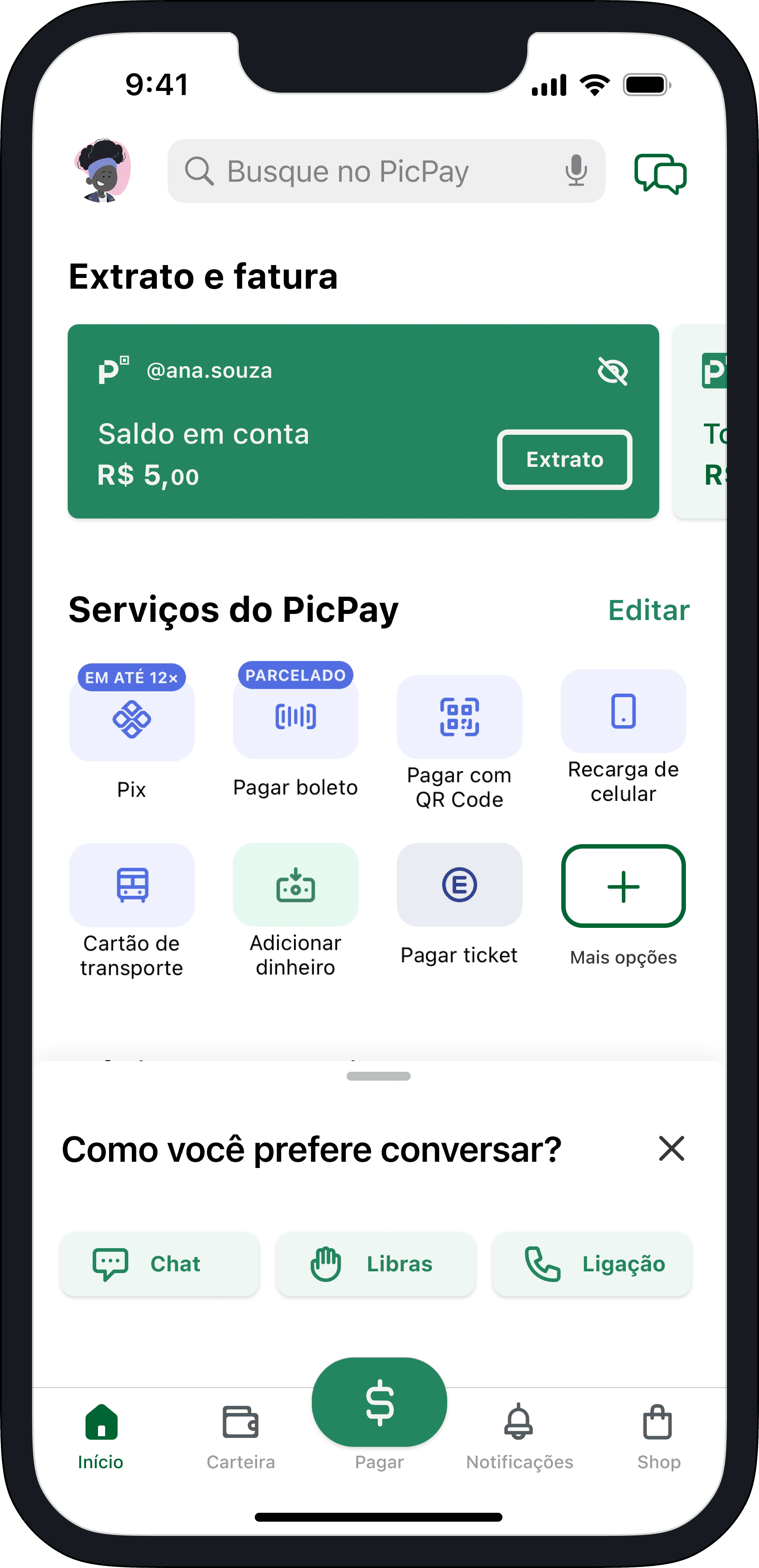
With the removal of the call to action banners, the "support options" bottom sheet may be moved to the support channel in the messages tab, so that the human representative is still accessible.
Reflections
Overall, I would like to revisit this project in the future, dedicating more time, as I know it doesn't truly reflect my skills. I've learned that time constraints, along with other resources (financial, people involved, and technical limitations), are the biggest challenge for a project. I believe that time, in particular, can be the main obstacle because even if there aren't many people on the team, with time, it's possible to implement all the planned features. The same idea applies to technical and financial limitations.
Ideation
With more time, I would've explored more creative paths, diverging design structures, generating more ideas creating more wireframes, and delving into alternative solutions.
Design
I would've liked to try more original designs. The banners could've had more graphic elements, not just text. I also would've liked to experiment with more colors and animations.
Tests
I wish I had more time to do more usability tests. I could've conducted A/B and SUS tests, as well as time on task for more design aspects, such as the perception of cognitive load of the home screen.
